03 - Paysafe - 2024
Skrill Wallet
A wallet that grows, not just moves
Crypto and stocks discovery inside a digital wallet used by 40 million people across 100+ countries. From research to shipped feature in 6 months.
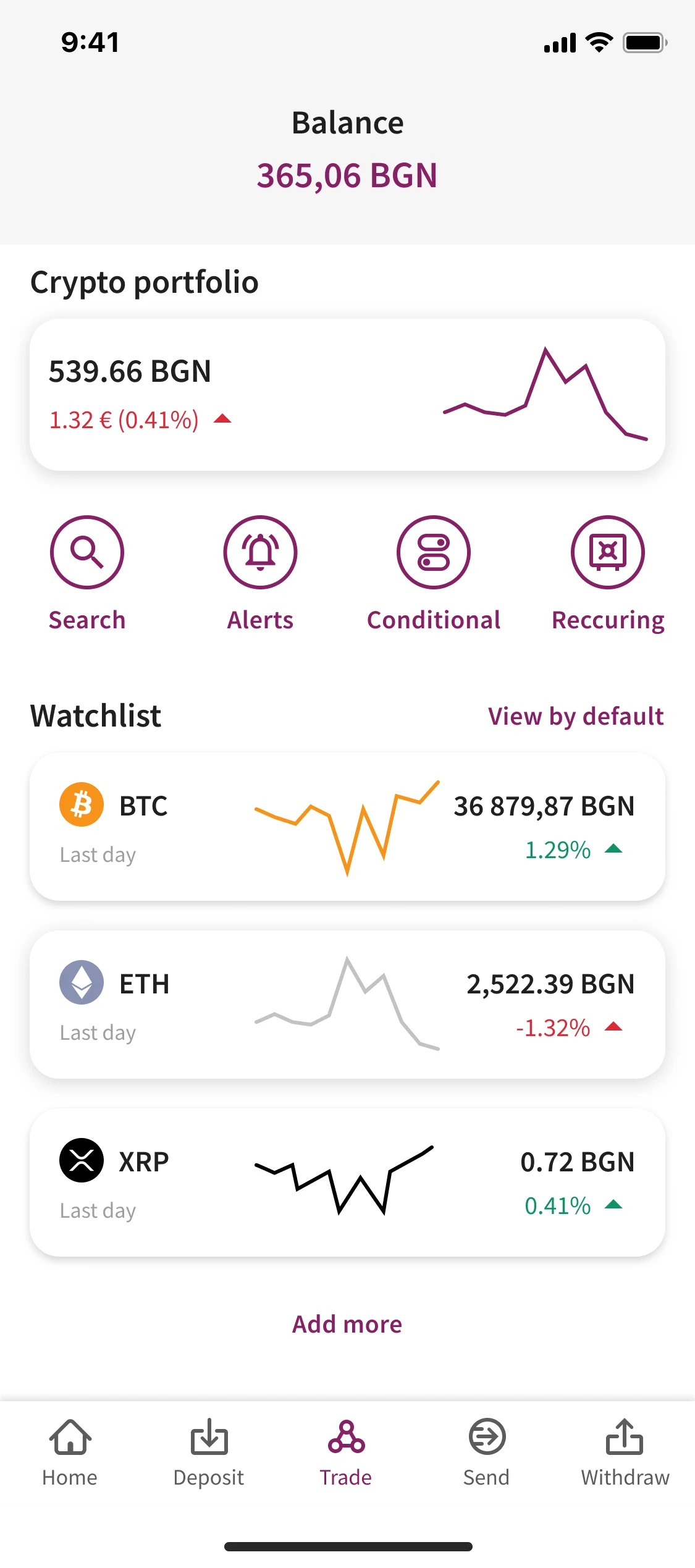
Skrill home. A wallet that grows, not just moves.
Overview
Skrill is a global digital wallet used by 40 million people across 100+ countries. In 2021, the product expanded from payments and money transfers into two new territories: cryptocurrency trading and stock investing. The challenge was not adding features. It was teaching a wallet audience that they could now grow their money, not just move it.
I led the design for the crypto and stocks discovery experience in the Skrill mobile app. The core problem: how do you introduce complex financial instruments to a user base that signed up for a payments wallet? Most Skrill users had never bought crypto or a stock. The interface had to feel like a natural extension of the wallet, not a bolted-on trading platform.
The problem
Before designing, we spent three weeks mapping the crypto newcomer journey. 16 user interviews, support tickets, app store reviews, and competitor onboarding flows.
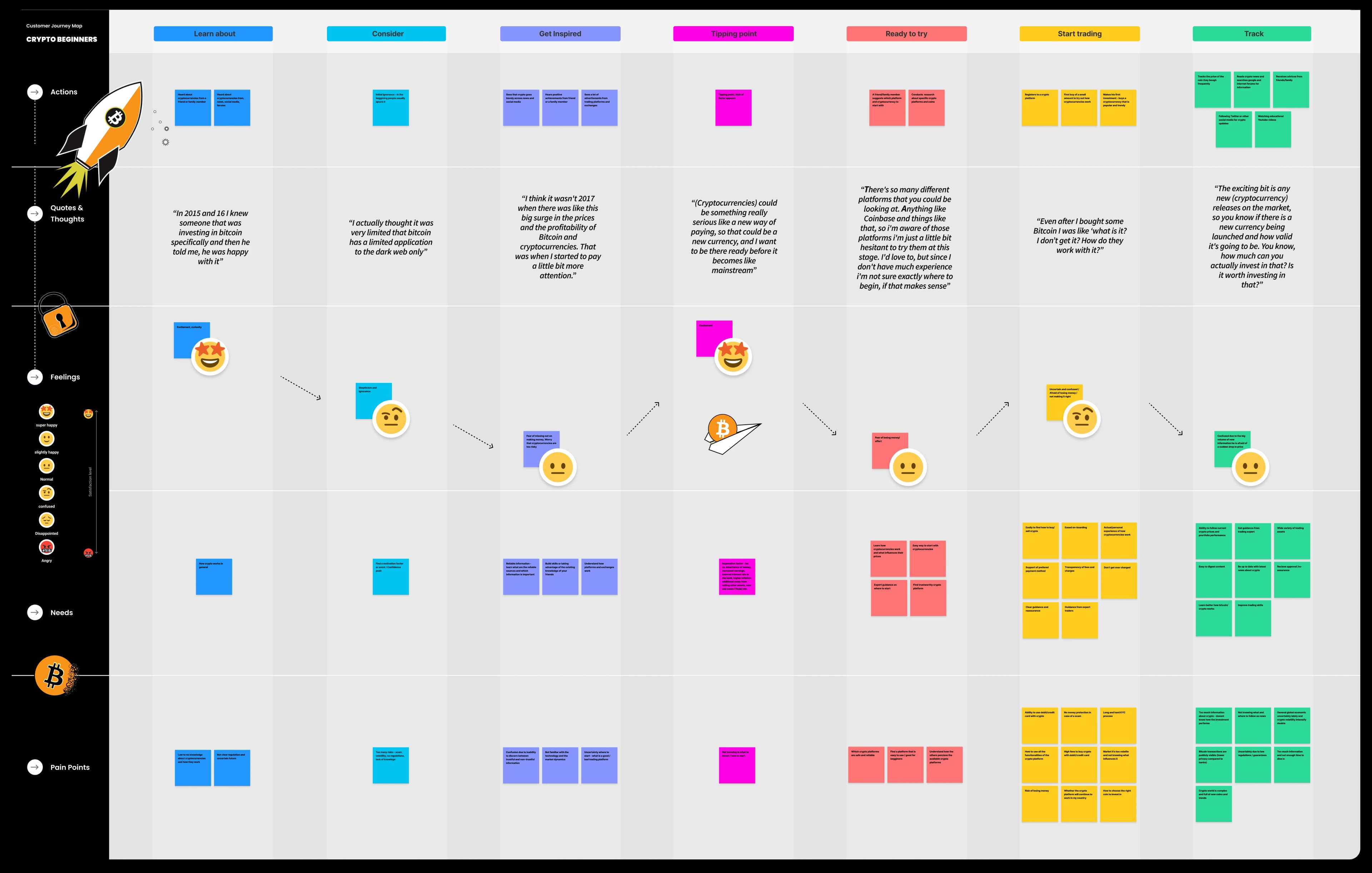
Discovery
| Stage | What users thought | What the app did | The gap |
|---|---|---|---|
| Awareness | I heard about Bitcoin on the news. Is it in Skrill? | Crypto tab buried in settings | Users did not know Skrill sold crypto |
| Discovery | I want to see what is available without committing | Required KYC before browsing | Killed curiosity before it became intent |
| Understanding | What is Ethereum? Is it like Bitcoin? | No educational content at asset level | Users picked assets by price, not purpose |
| First purchase | I want to try with 10 euros | Minimum 50 euros for some assets | Barrier too high for experimentation |
| Post-purchase | What did I just buy? Where is it? | Crypto held in pooled custody, no wallet address | Users did not understand ownership |
The pattern was clear. Skrill had built a trading interface for people who already traded. But 80% of the user base had never bought crypto. The experience map showed a cliff at every stage. Users fell off before they ever made a first purchase.
Competitive research
I benchmarked 18 apps across three categories:
Benchmark: 18 apps
Neobanks
Revolut, N26, Monzo
What they did well
Clean discovery, low minimums, educational nudges
What they did poorly
Limited asset range, shallow data
Crypto-native
Coinbase, Binance, Kraken
What they did well
Deep markets, advanced tools
What they did poorly
Hostile to newcomers, complex KYC, jargon-heavy
Wallet-first
PayPal, Cash App, Venmo
What they did well
Familiar interface, trust from payments
What they did poorly
Weak discovery, limited assets, poor education
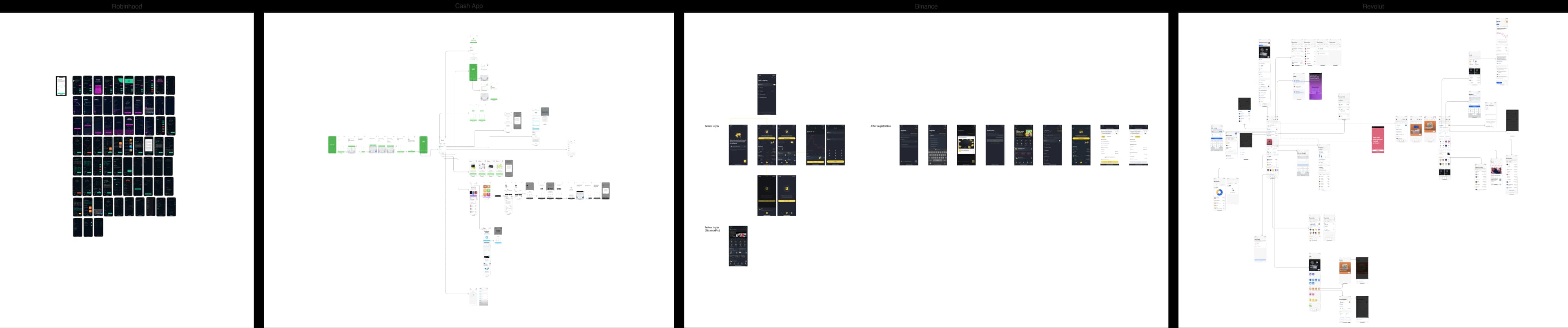
The gap: nobody combined wallet trust with gentle discovery with meaningful education at the asset level. Revolut came closest, but their crypto flow still assumed some prior knowledge. We had an opportunity to build the most newcomer-friendly asset picking experience in the market.
Goals
A Skrill user who has never bought crypto should discover the feature, understand what an asset is, and make a first purchase in under 10 minutes
Solves: the experience map showed a cliff at every stage of the newcomer journey
The asset picking interface must feel like a natural extension of the wallet. Not a separate trading app
Solves: Skrill had built a trading interface for people who already traded
Educational content must be embedded at the point of decision, not buried in a help center
Solves: users picked assets by price, not purpose
Design for "growth by familiarity". Start with what users know (payments, balances), then introduce new concepts
Solves: 80% of the user base had never bought crypto
UX thinking
From experience map to design principles
Every gap in the experience map became a design principle. We did not just solve the problems. We inverted them into the product's DNA.
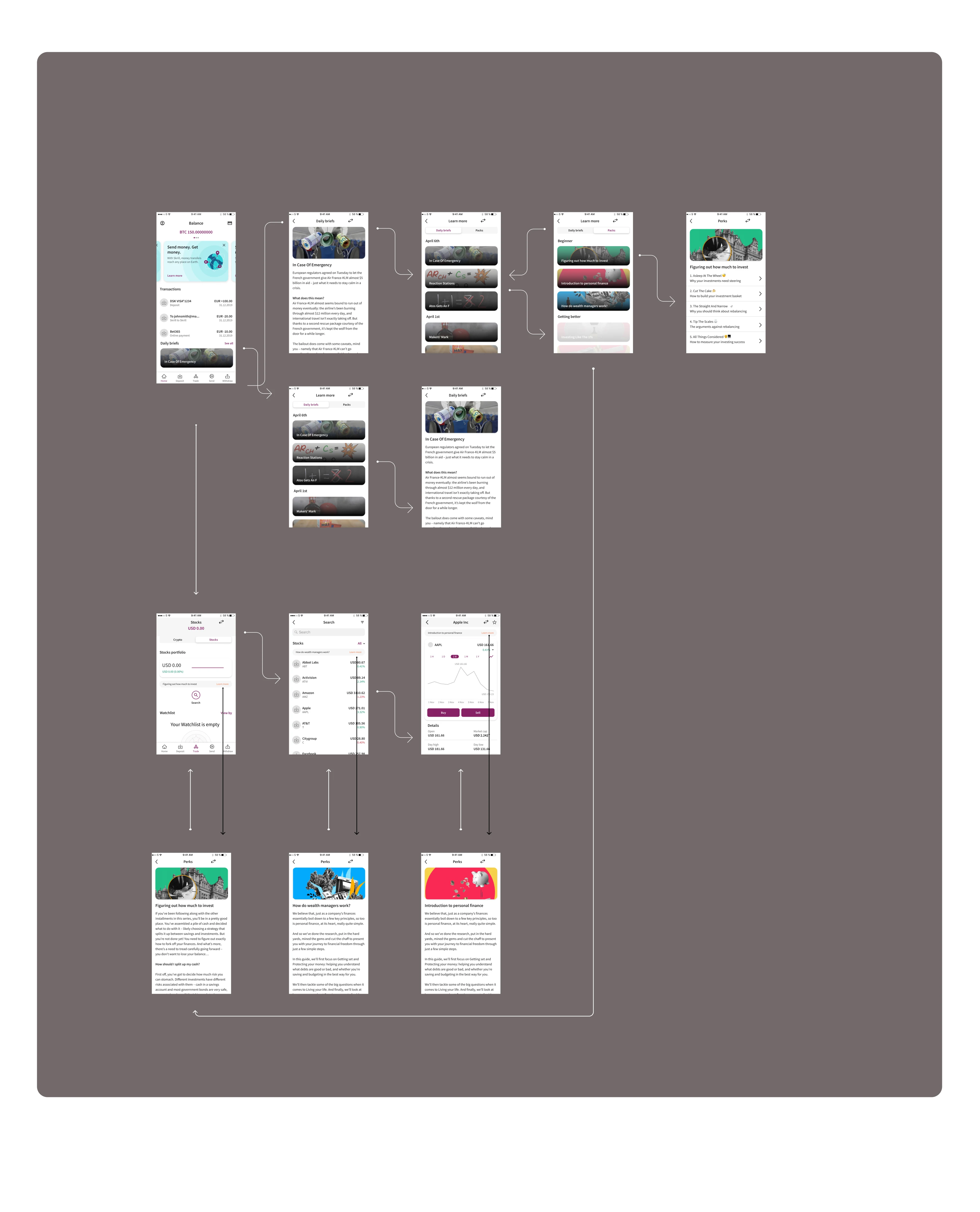
The journeys we mapped:
- 01
Complete newcomer: Opens app, sees crypto tab, browses assets, reads "What is Bitcoin?", buys 10 euros, sees portfolio
- 02
Curious transfer user: Sends money to friend, sees "Grow your balance" nudge, explores crypto, buys first asset
- 03
Existing crypto user: Knows what they want, searches, buys immediately, sets price alert
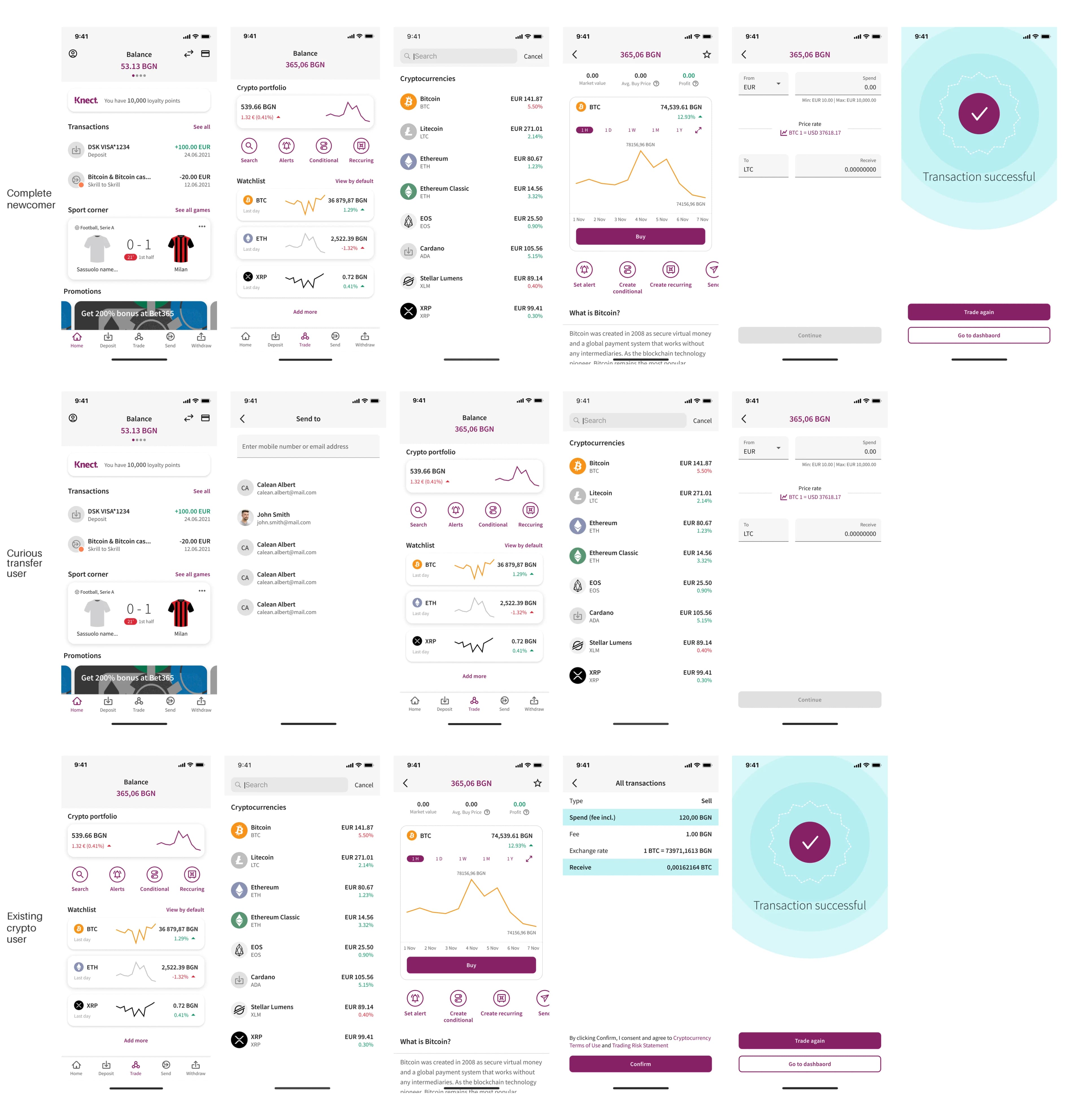
Edge cases that shaped the design:
- -
KYC rejection: Not all countries supported crypto. We designed a graceful fallback. "Crypto is not available in your region yet. Here is what is coming."
- -
Price volatility during purchase: Crypto prices change in seconds. We added a 15-second price lock with countdown, then explicit re-quote.
- -
Insufficient balance: User has GBP but wants to buy crypto in EUR. We auto-convert with clear rate display, instead of blocking.
- -
Network fees surprise: Users did not expect fees on top of the purchase. We surfaced all fees before confirmation, not after.
- -
Withdrawal confusion: "I bought Bitcoin, why can not I send it to my friend?" We explained pooled custody versus wallet ownership at purchase and in portfolio.
Alternatives we explored and rejected:
- 01
RejectedA separate "Skrill Invest" app
Fragmented the user base. Users trust the Skrill wallet. A separate app would feel like a different company.
- 02
RejectedReal-time price charts as the hero
Too trading-app. For newcomers, a price chart is noise. We made the asset description the hero, with the chart secondary and collapsible.
- 03
RejectedA "crypto academy" section
Education buried in a separate tab is education nobody sees. We embedded learning at the asset detail level instead.
- 04
RejectedSocial features (see what friends buy, copy trading)
Wrong audience and regulatory risk. Skrill users are privacy-conscious. Social proof would erode trust.
- 05
RejectedGamification (badges for first purchase, streaks)
Off-brand for a wallet. The reward is growing wealth, not a badge. We used progress indicators instead. "Your first crypto purchase" as a portfolio milestone.
Decisions
05.1Asset picking is discovery, not search
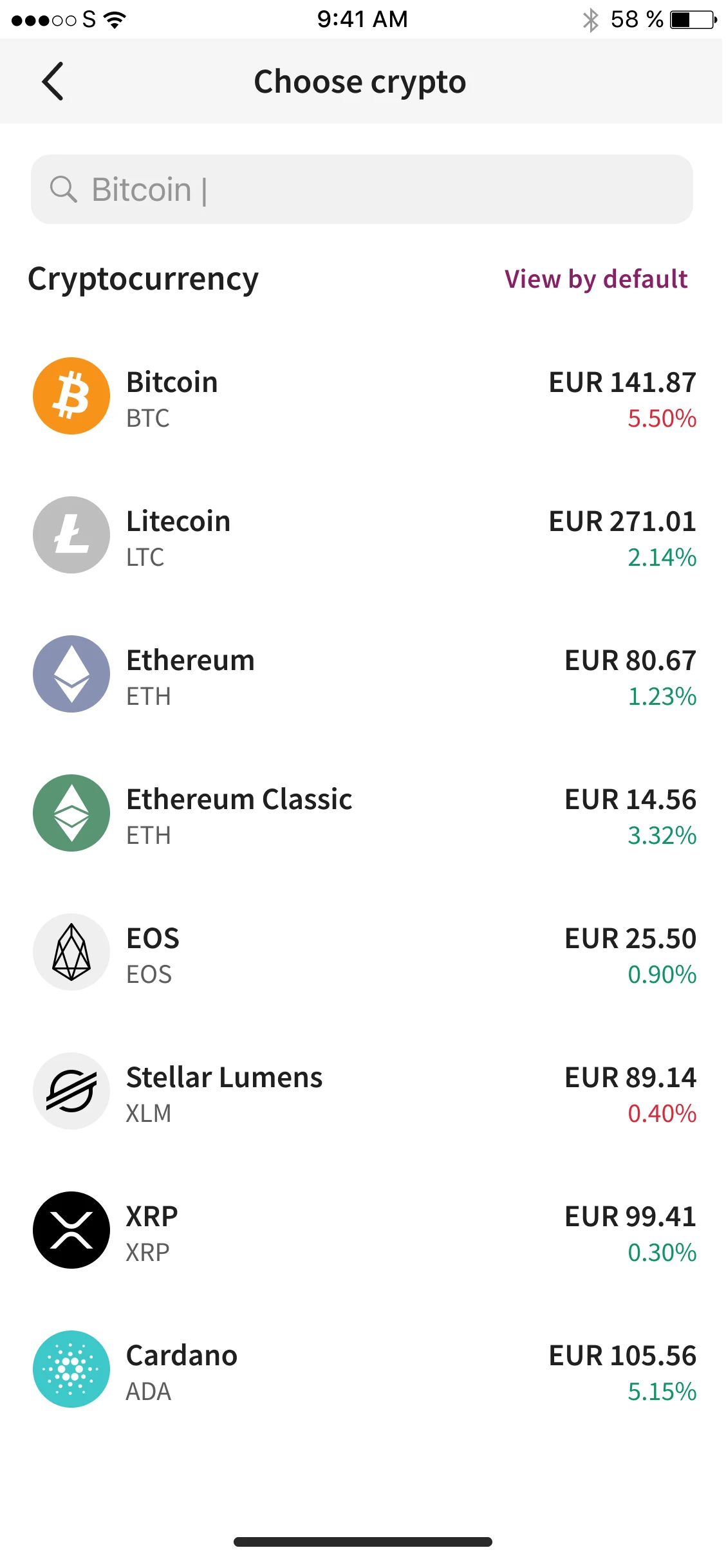
Most trading apps assume users know what they want. We designed for the opposite. A user who opens the crypto tab with no idea what is available. The asset list is curated, not exhaustive. "Popular," "Trending," "New," and "By category." Each asset has a one-line description visible before tapping. Search is available but not the primary entry point. The goal: browse, learn, then decide.
05.2"What is this?" at the point of decision
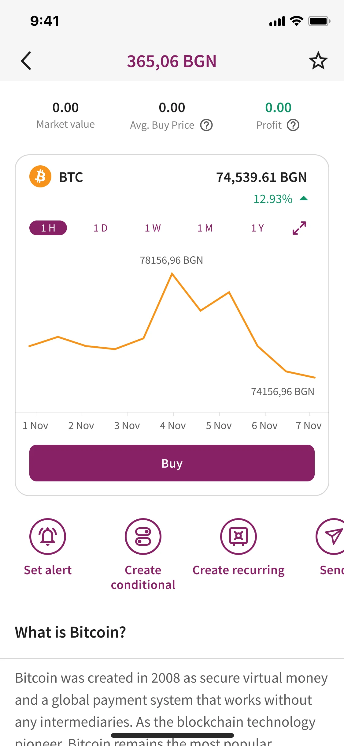
Every asset detail screen has an expandable "What is this?" card. It explains the asset in plain language. What it is. Why people buy it. The risks. For stocks: "Apple is a technology company." For crypto: "Bitcoin is a digital currency." This is not a help article. It is embedded education that appears exactly when curiosity peaks. We A/B tested. Screens with the card had 34% higher purchase completion.
05.3Honest fees, honest custody
The old pattern in fintech: hide fees until checkout, explain custody in terms nobody reads. We inverted both. All fees are surfaced on the asset detail screen before the user taps "Buy." Custody is explained at first purchase. "You own the value of this Bitcoin. Skrill holds it securely. You can withdraw to your own wallet anytime." No surprises. No jargon.
05.4Growth by familiarity
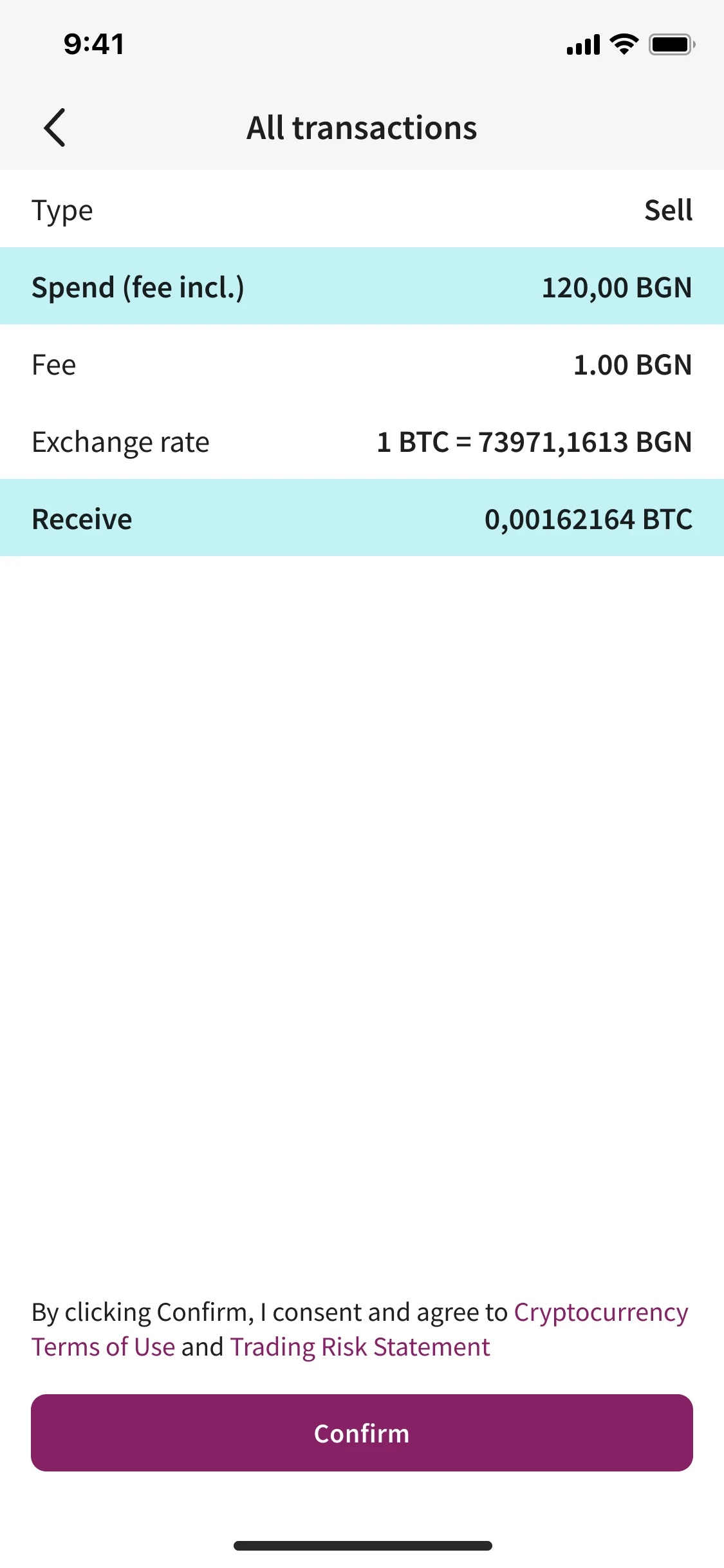
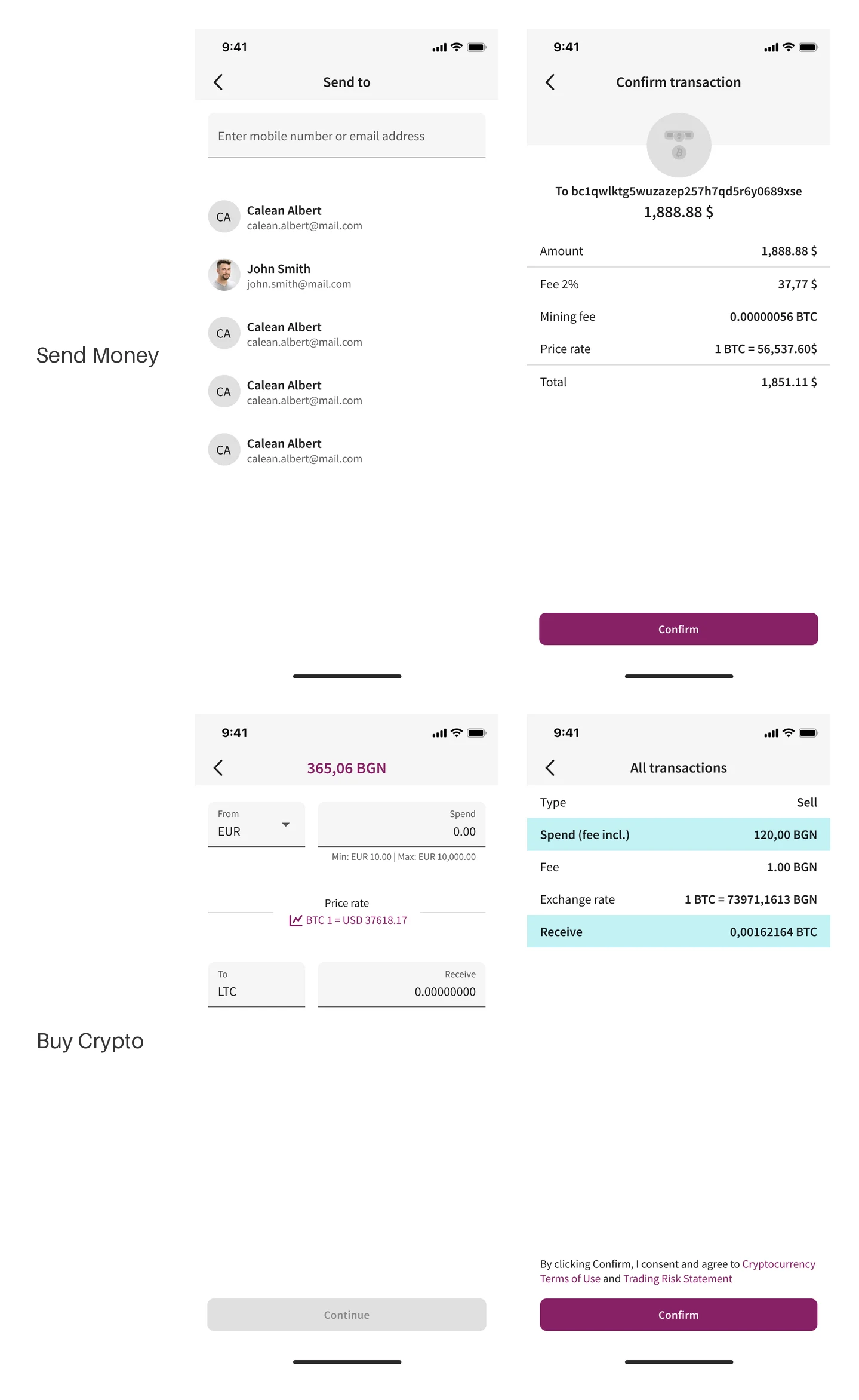
The design language starts with what users know. The crypto tab uses the same iconography as the payments tab. Balances look like balances. The purchase flow mirrors the "Send Money" flow users already know. Amount, review, confirm. New concepts are introduced gradually. First you buy. Then you learn about wallets. Then you discover withdrawal. Not all at once.
Process
Discovery before design
Three weeks of research before a single wireframe. 16 user interviews. 18 competitor audits. Support ticket analysis. The experience map. The experience map became the single most referenced artifact in the project. Hung in the office. Shared with stakeholders. Used to settle debates about scope.
Flows before pixels
Every journey was mapped as a flow, then wireframed, then tested with 5 users per iteration. We ran 4 rounds of usability testing on the asset picking flow alone. Key finding from round 2: users did not understand "market order" versus "limit order." We replaced the jargon with "Buy now" and "Buy when price reaches." Purchase completion jumped 28%.
Mobile-first, always
Every design decision was tested on a phone first. The asset list is thumb-scannable. The "What is this?" card expands with a tap, not a link. The purchase flow fits in a single thumb zone. We designed for the bus, the queue, the couch. Not the desk.
Impact
I led the design for crypto and stocks discovery, from research through shipped UI and design system. The feature rolled out to 40+ countries on iOS and Android.
23%
Crypto activation in 30 days (vs 8% benchmark)
41%
First-purchase completion (vs 19% before)
27EUR
Average first purchase (vs 85 euro minimums)
67%
"What is this?" card engagement
52%
Fewer "what did I buy" support tickets
What I shipped:
- -
Crypto and stocks asset picking flows (iOS + Android)
- -
"What is this?" embedded education system
- -
Curated asset discovery with smart categorization
- -
Purchase flow with honest fee surfacing and custody explanation
- -
Price lock and re-quote mechanism for volatile assets
- -
Design system shared across iOS, Android, and web
Hindsight
If I revisited this project today, I would change three things:
Add a "practice portfolio" mode that makes tracking fun and buying more insightful. We saw users hesitate at their first real purchase even with 1 euro minimums. A simulated portfolio with fake money would let users learn by doing without risk.
Push harder on the withdrawal experience. We explained custody at purchase, but the withdrawal flow to an external wallet was still confusing for newcomers. I would design a guided "Your first withdrawal" flow with embedded security education.
Design for the "empty portfolio" state more deliberately. The first-time portfolio screen with zero assets felt like a dead end. I would add a "Discover your first asset" call to action and a sample portfolio preview to reduce the psychological barrier of the first purchase.
Synthesis
What it taught me
- 01
meet users in the app they already trust
- 02
new power must inherit old patterns
- 03
“one tap to own” beats a powerful terminal nobody opens