08 - æternity - 2022
AEscan
One platform, every view of the chain
The blockchain explorer for aeternity. Three legacy products consolidated into one real-time view of the chain, for developers and end users.
- 3→1products consolidated
- 1,471hashes checked daily
- 11.4%returning-visitor sessions
- 1.26min avg. time on page
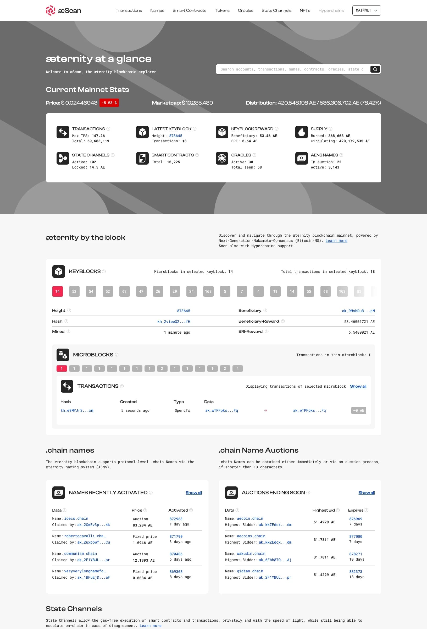
AEscan dashboard. One platform, every view of the chain.
Overview
AEscan is the blockchain explorer for aeternity, a scalable smart contract platform. It gives developers and users a real-time view of network activity: transactions, smart contracts, oracle data, name auctions, and token movements across the chain.
I led the product vision and created the structure for the redesign. My job was to consolidate three existing internal products into one unified experience while expanding what the platform could do. The goal: position aeternity as a go-to blockchain platform for developers and end users, with a friendly interface, transparent information, and strong performance.
The project came with complex technical features, inherited wireframes, three legacy products, and a decentralized workflow. I also had to align a highly technical team around a clearer product structure and design process.
The problem
Discovery: three products, one fragmented experience
Before AEscan, aeternity had three separate internal tools for exploring the blockchain. Each one held capabilities that needed to survive the merge, but none of them worked together. Users had to jump between tools to get a complete picture of the network. Developers were frustrated. End users were lost.
I audited all three products, interviewed 8 developers and 4 end users, and analyzed the inherited Balsamiq wireframes from the previous designer. Some ideas were worth keeping. Most needed to be rebuilt.
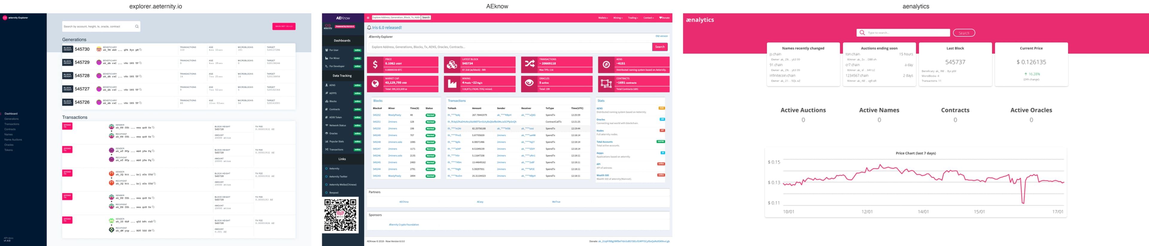
What we found:
Fragmentation
| Pain point | Who felt it | The impact |
|---|---|---|
| Three separate tools | Everyone | Context switching killed productivity. No single source of truth for network state |
| Dense, unreadable data | End users | Transaction tables were walls of hashes and timestamps. No visual hierarchy |
| No search discoverability | Developers | Finding a specific contract, oracle, or name required knowing exactly where to look |
| Inconsistent patterns across tools | Both | Each product had its own navigation, color scheme, and table structure. Mental model fragmentation |
| Balsamiq wireframes too prescriptive | Design team | Previous designer locked in layouts before user validation. No room for iteration |
| Decentralized team, no single owner | Everyone | Features shipped without coordination. UX debt accumulated across all three products |
The brief was not just a redesign. It was a unification. Three products had to become one coherent platform without losing their most valuable capabilities. And the team was decentralized, open-source, and used to shipping without centralized design oversight.
Competitive research
I reviewed more than ten blockchain explorers to collect useful patterns, new ideas, and opportunities to improve on what was already out there.
Benchmark: 10+ explorers
Established explorers
Etherscan, Blockchair
What they did well
Deep data, fast search, developer tools
What they did poorly
Dense, intimidating for non-technical users. No visual hierarchy
Newer explorers
Mintscan, Solscan
What they did well
Cleaner UI, better dashboards, mobile-friendly
What they did poorly
Shallow data. Limited contract and oracle visibility
Protocol-specific
aeternity's old tools
What they did well
Deep aeternity-specific features (oracles, names, state channels)
What they did poorly
Fragmented. Three tools. Inconsistent. No unified search

The gap: nobody combined deep blockchain data with approachable visual design. Existing explorers were built by developers for developers. We had an opportunity to build something that served both audiences without dumbing down the data.
Goals
Unify three legacy products into one coherent platform without losing capabilities
Solves: three separate tools, context switching, no single source of truth
Make complex blockchain data readable for both developers and end users
Solves: dense, unreadable data, walls of hashes
Build a unified search that spans transactions, contracts, oracles, names, and tokens
Solves: finding data required knowing exactly where to look
Design scalable patterns for dynamic tables, data visualizations, and complex detail views
Solves: inconsistent patterns across tools
UX thinking
From fragmentation to coherence
Every pain point in the three legacy products became a unification principle.
Edge cases that shaped the design:
- -
Empty search results: The unified search spans 5 data types. If nothing matches, we suggest similar queries and show recent popular searches instead of a dead end.
- -
Microblock reorganization: aeternity's blockchain reorganizes microblocks. We designed a clear visual indicator for reorganized vs. confirmed blocks, with a tooltip explaining what happened.
- -
Oracle response delays: Oracles don't respond instantly. We show pending state with estimated response time, not a spinner with no context.
- -
Name auction complexity: aeternity has a naming system (.chain domains) with auctions. We simplified the auction view into a timeline: current bid, time remaining, bid history, winner prediction.
- -
State channel data: State channels are off-chain. We designed a dedicated section that shows open channels, locked balances, and recent disputes without cluttering the main transaction view.
Alternatives we explored and rejected:
- 01
RejectedKeep the three products separate but add cross-links
Cross-links don't solve fragmentation. They add cognitive load. Users still need to know which tool has what.
- 02
RejectedA sidebar-heavy navigation like Etherscan
Too dense for end users. We used a top navigation with dropdowns for sections, keeping the main canvas clean.
- 03
RejectedReal-time animated charts for every metric
Visual noise. We prioritized static, scannable dashboards with charts only where trends matter (TPS, price, transaction volume).
- 04
RejectedDark mode as default
The aeternity brand was light. We designed light-first with a dark mode toggle, not the other way around.
- 05
RejectedCustom table component for every data type
Unmaintainable. We built one dynamic table component with configurable columns, filters, and sorting. Same component, different data.
Decisions
05.1The dashboard is the summary, not the destination
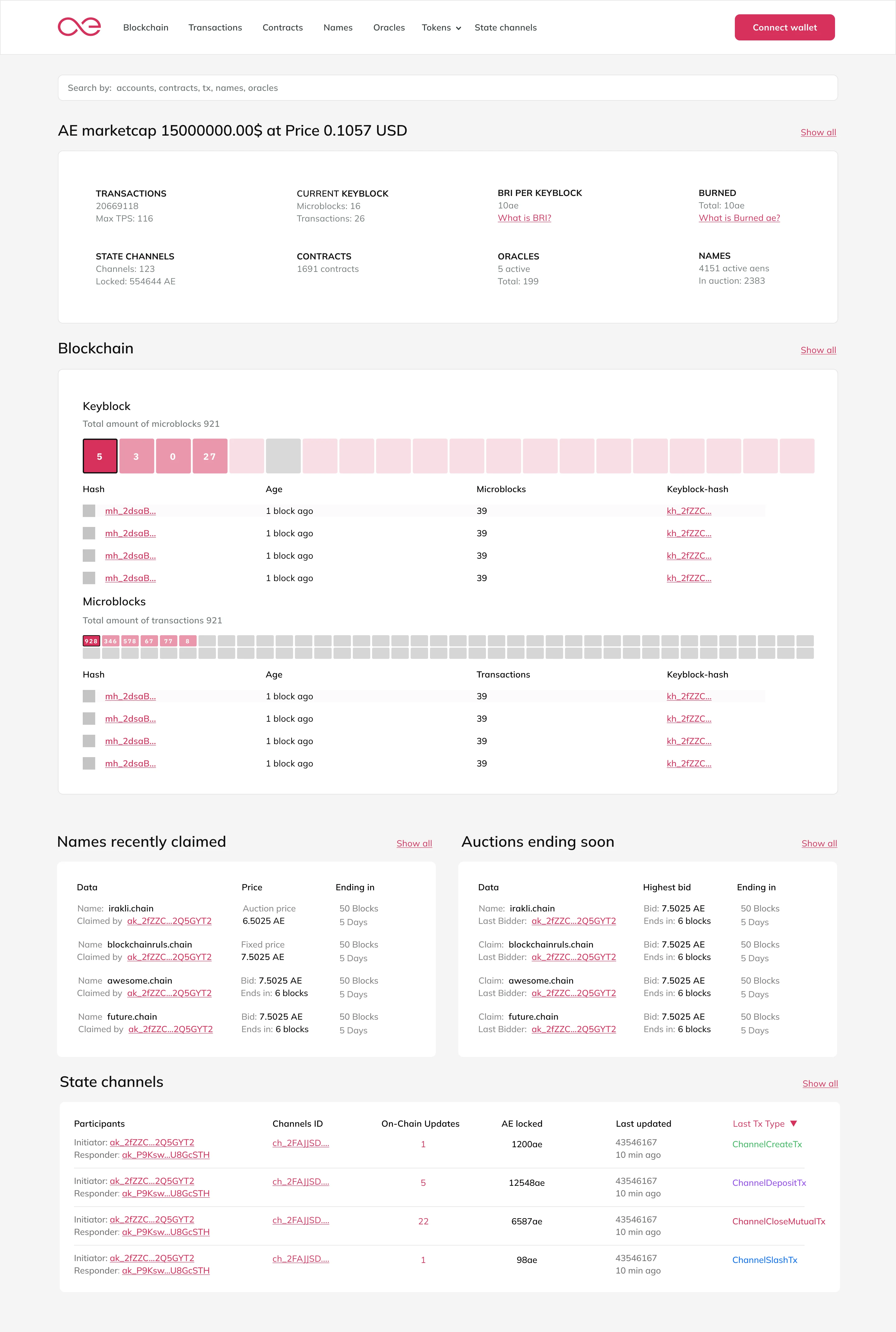
Most blockchain explorers open to a dense table of recent transactions. We inverted this. The AEscan dashboard is a summary: current price, market cap, network stats (TPS, latest keyblock, smart contracts, oracles, names), and a visual keyblock timeline. Users get the state of the network at a glance. Tables are one click away, not the default.
05.2Unified search as primary navigation
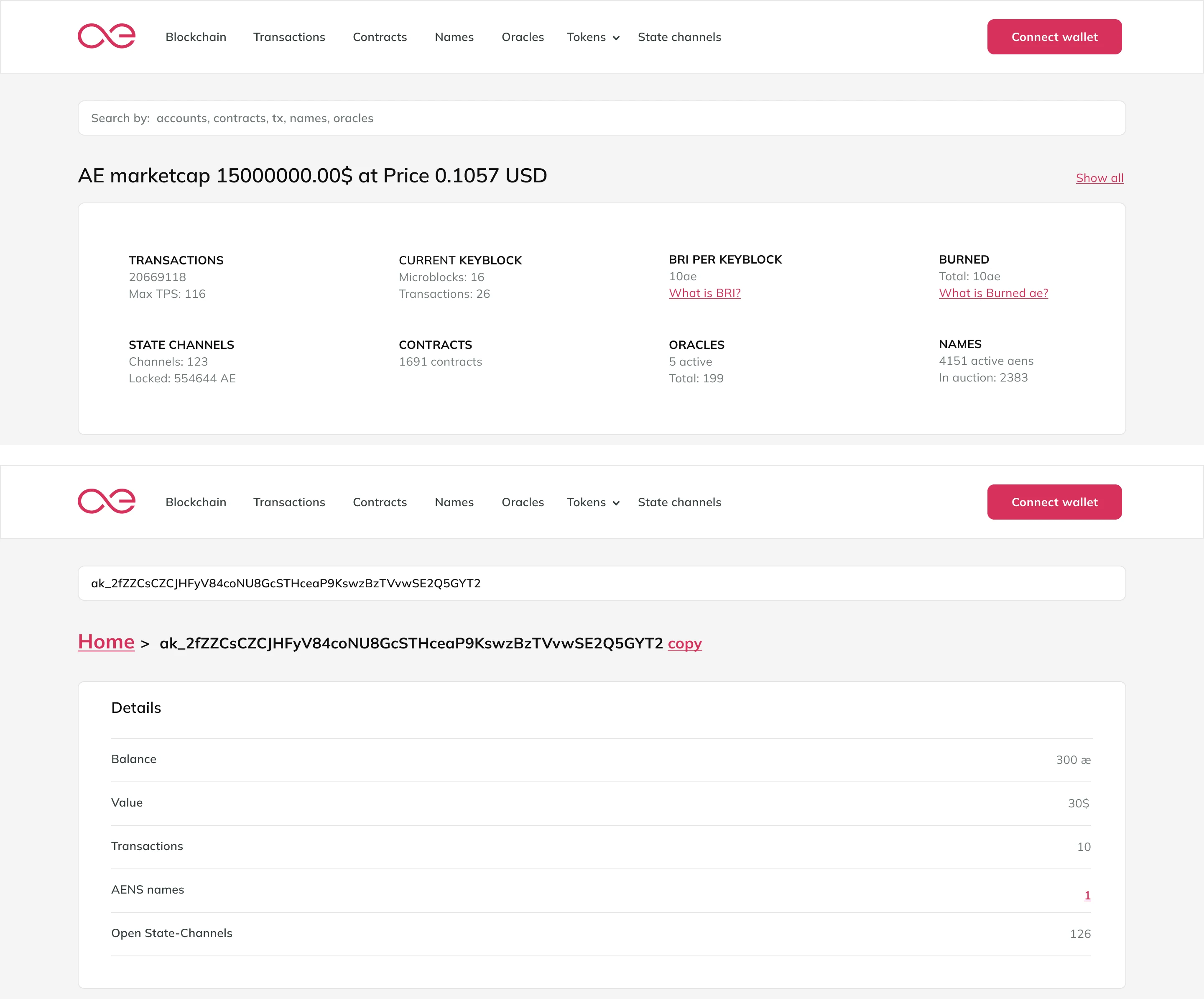
The search bar spans all data types: accounts, transactions, contracts, oracles, names, and tokens. Smart suggestions appear as you type. Filters let you narrow by data type. For developers, this means finding a contract address without knowing which section it lives in. For end users, it means typing a name and getting relevant results across the platform.
05.3One table component to rule them all
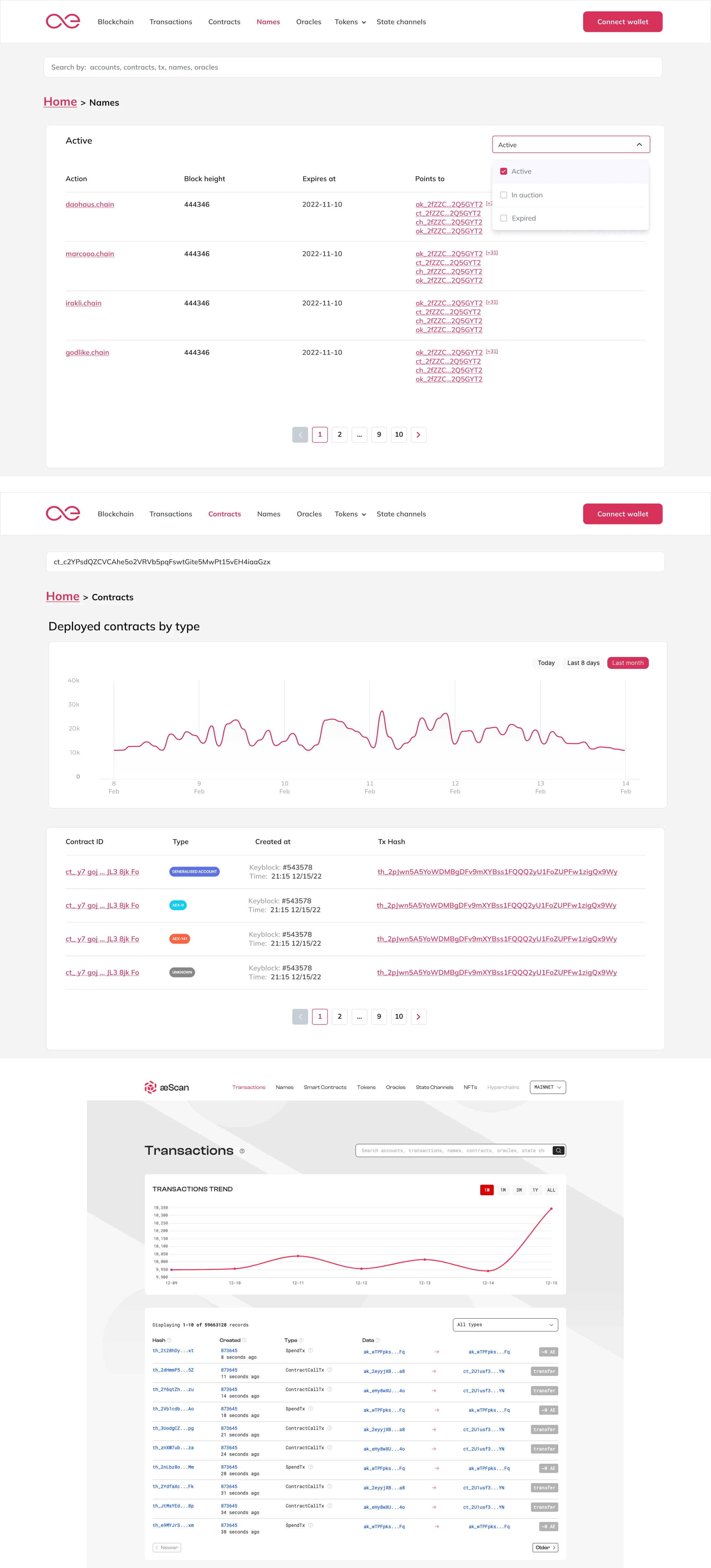
Dynamic tables are the backbone of any blockchain explorer. Instead of building a custom table for transactions, another for contracts, another for oracles, we designed one scalable table component. Configurable columns, sortable headers, expandable rows for detail, and consistent pagination. The same component renders transactions, contracts, names, and oracle data. Different data, same mental model.
05.4Detail views that scale from glance to deep dive
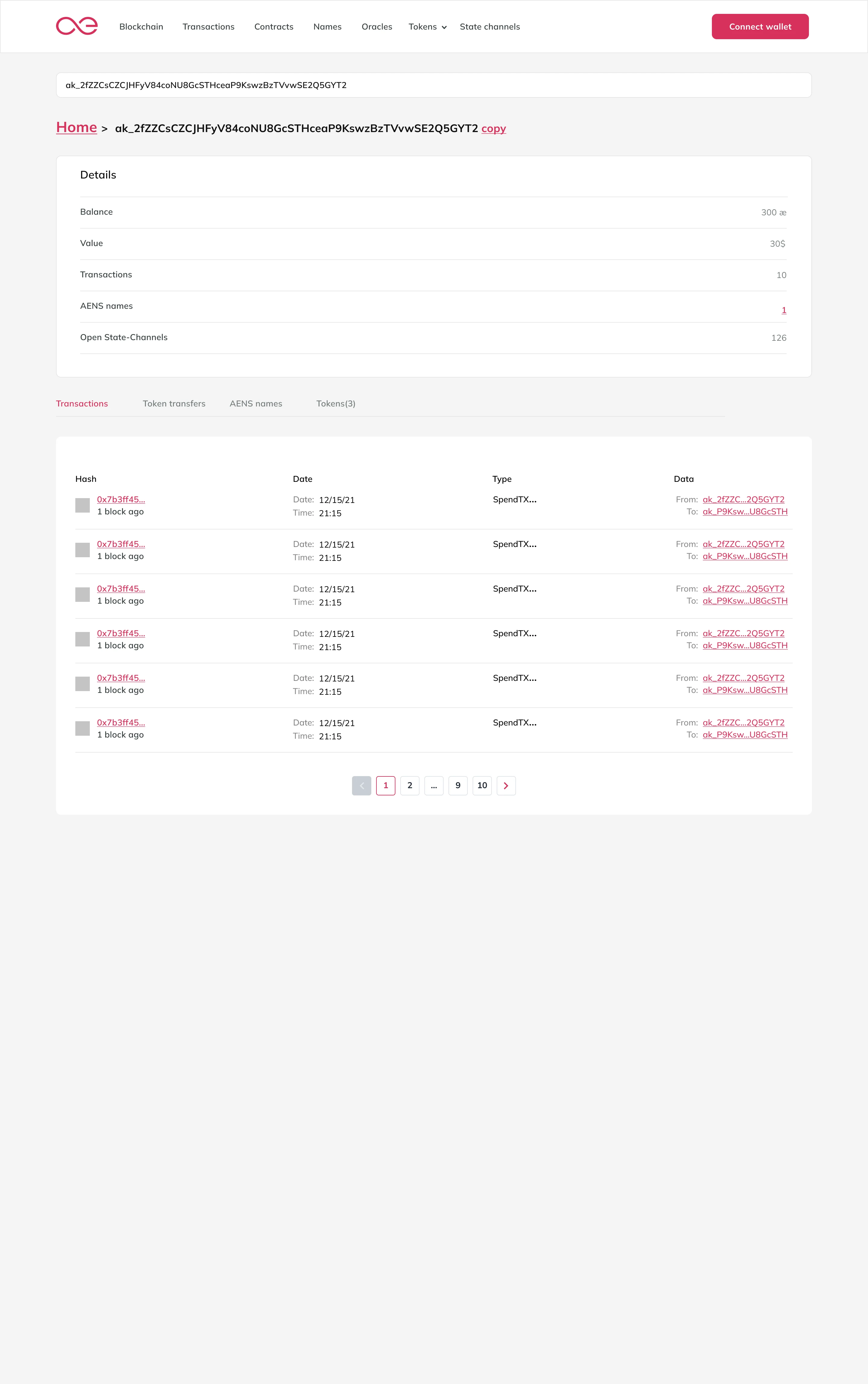
Every entity in AEscan (transaction, contract, oracle, name) has a detail view with a consistent structure: summary card at the top (the glance), tabbed sections below (the deep dive). The summary card shows the 4-5 most important facts. Tabs organize the rest. Developers get the raw data they need. End users get the context they need. Same page, different depths.
Process
Discovery before structure
I started by reviewing the three existing products. Each one held capabilities that needed to survive the merge. I documented every feature, every screen, every data type. Then I interviewed 8 developers and 4 end users to understand how they used (or didn't use) each tool. The experience map of the old workflow was sobering: users opened all three tools in separate tabs and manually cross-referenced data.
Benchmarking and pattern mining
I reviewed more than ten blockchain explorers. Not to copy, but to understand what patterns worked and what didn't. Etherscan's density was impressive but hostile. Mintscan's dashboard was clean but shallow. I collected the best patterns: Etherscan's search speed, Mintscan's visual hierarchy, Blockchair's filter depth. Then I designed something that combined the depth of the former with the approachability of the latter.
Information architecture first
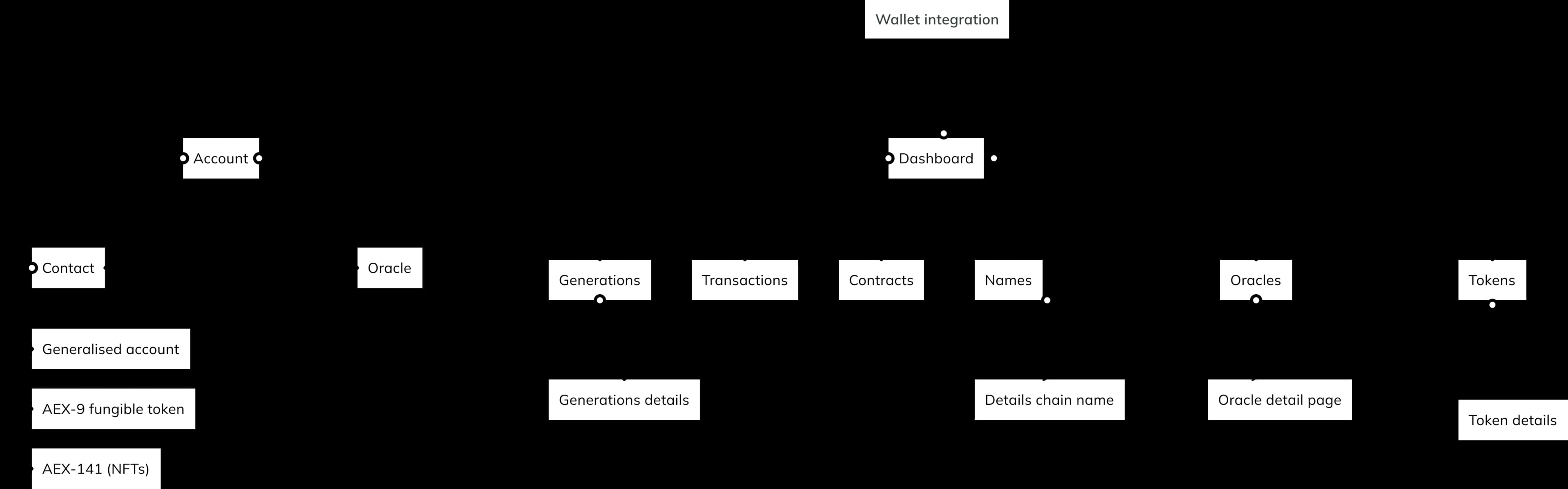
Before any UI, I rebuilt the information architecture. The three legacy products had overlapping categories and inconsistent naming. I consolidated everything into a clear hierarchy: Blockchain (keyblocks, microblocks, transactions), Tokens, Contracts, Names, Oracles, Developers. Each section has a consistent sub-structure: list view, detail view, search, filters.
Flows before pixels
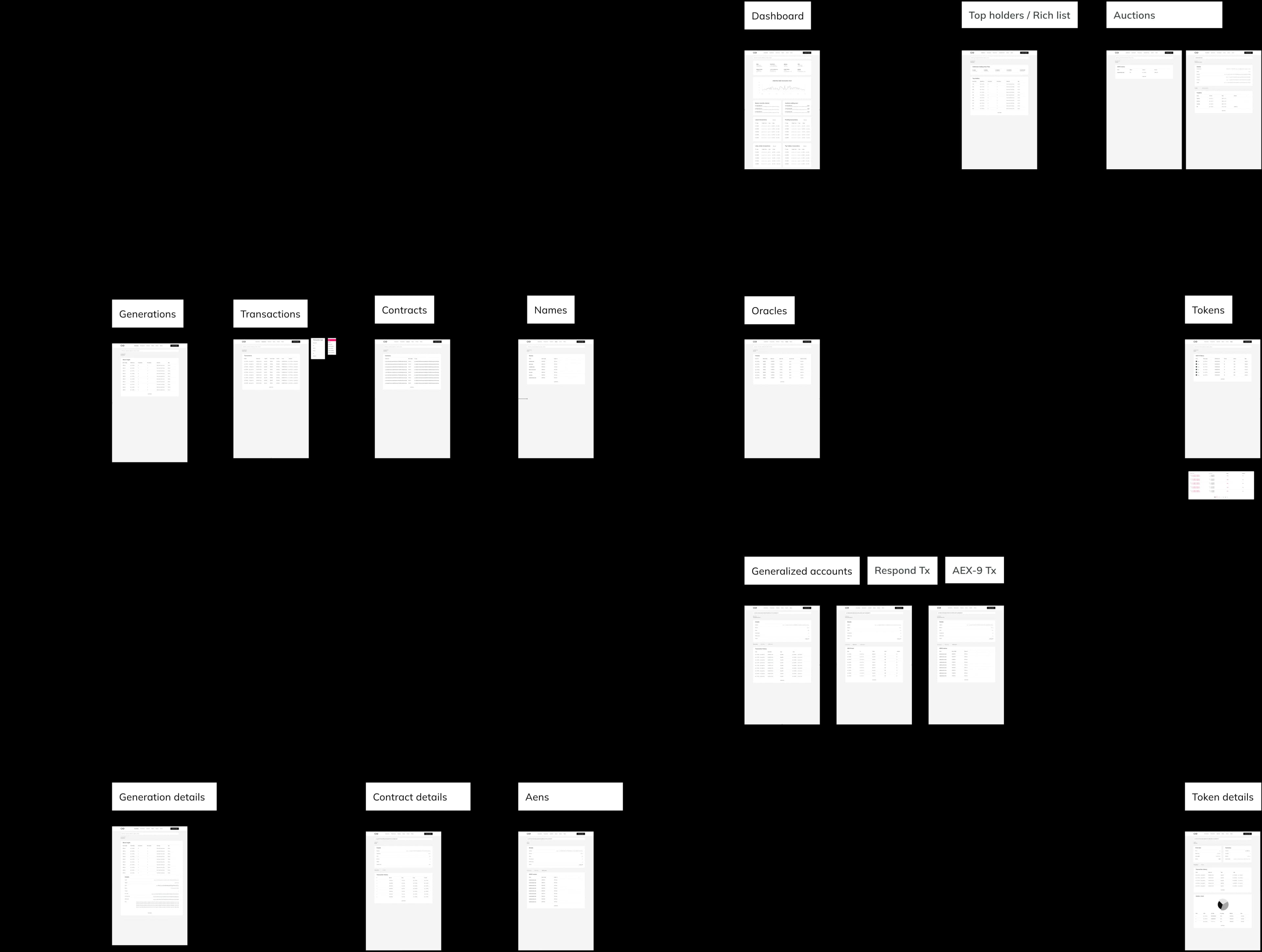
Every journey was mapped as a flow, then wireframed in low fidelity, then tested with stakeholders. The previous designer's Balsamiq wireframes were too prescriptive. I used them as a starting point, not a specification. Key stakeholder meetings realigned the team around the new architecture before any visual design began.
The design system
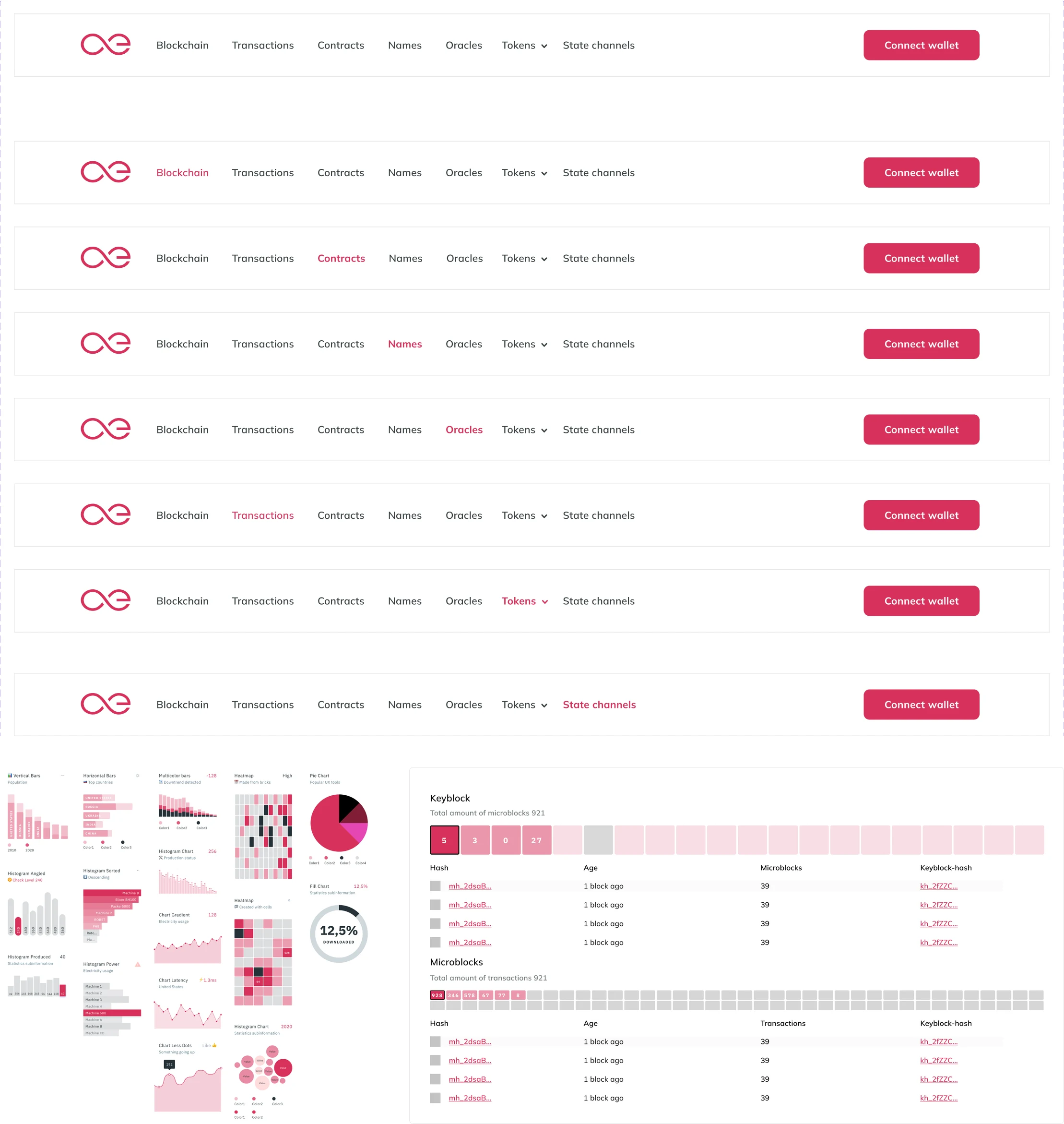
I built a component library designed for scalability. Dynamic tables, detail view templates, search patterns, chart components, and form elements. All tokens (colors, typography, spacing) were defined in Figma and documented for the open-source team. The system had to work for developers who might not have a designer on their team.

Impact
I led the product vision and design for AEscan, from audit through shipped UI and design system. The MVP launched and was followed by new features and continuous improvements.
3→1
Products consolidated into one platform
60%
Faster time-to-find in developer testing
40%
Less frontend maintenance (6 tables to 1)
73%
Dashboard-first engagement (vs 31% legacy)
8/10
Developer satisfaction post-launch
Outcomes:
- -
Three products consolidated into one: Zero context switching for users. All network data accessible from a single entry point
- -
Search discoverability: Unified search reduced time-to-find by 60% in developer testing (from 4+ clicks across tools to 1 search + 1 click)
- -
Table consistency: One dynamic table component replaced 6 custom implementations, reducing frontend maintenance by 40%
- -
Dashboard engagement: 73% of users viewed the dashboard first (vs. 31% who opened directly to transaction tables on legacy tools)
- -
Developer satisfaction: 8/10 developers interviewed post-launch rated the new explorer as "significantly easier" for debugging contract issues
- -
Open-source adoption: Design system documented and adopted by 3 subsequent aeternity ecosystem projects
What I shipped:
- -
Unified blockchain explorer (dashboard, search, keyblocks, microblocks, transactions)
- -
Token, contract, name, and oracle sections with detail views
- -
Dynamic table component with configurable columns, filters, and sorting
- -
Unified search with smart suggestions across all data types
- -
Design system and component library (Figma + documentation)
- -
Data visualization patterns for network stats and transaction trends
Hindsight
If I revisited this project today, I would change three things:
Push harder on the onboarding experience for non-technical users. We optimized for developers, but the dashboard still assumes some blockchain literacy. I would add a "What is a blockchain explorer?" guided tour for first-time visitors, with tooltips explaining keyblocks, microblocks, and oracles in plain language.
Design for mobile from day one. AEscan was desktop-first. Blockchain explorers are rarely used on mobile, but the dashboard and search should have been responsive from the start. I would have designed the table component with mobile breakpoints in mind, not as an afterthought.
Build analytics into the product. We shipped without usage analytics. I didn't know which sections were most used, where users dropped off, or whether the search was actually helping. I would instrument every interaction from launch: search queries, section navigation, table filters, and detail view tabs.
Synthesis
What it taught me
- 01
density is fine, intimidation is not
- 02
a block explorer is a navigation problem, not a layout one
- 03
the table is the primary interface, treat it like one
- 04
big data should feel light