01 - Injective Labs - 2026
TrueCurrent Exchange
Centralized-exchange speed, self-custody guarantees
A decentralized exchange for institutional-grade spot trading on Injective. From a blank Figma file to live trading in production in 4 months.
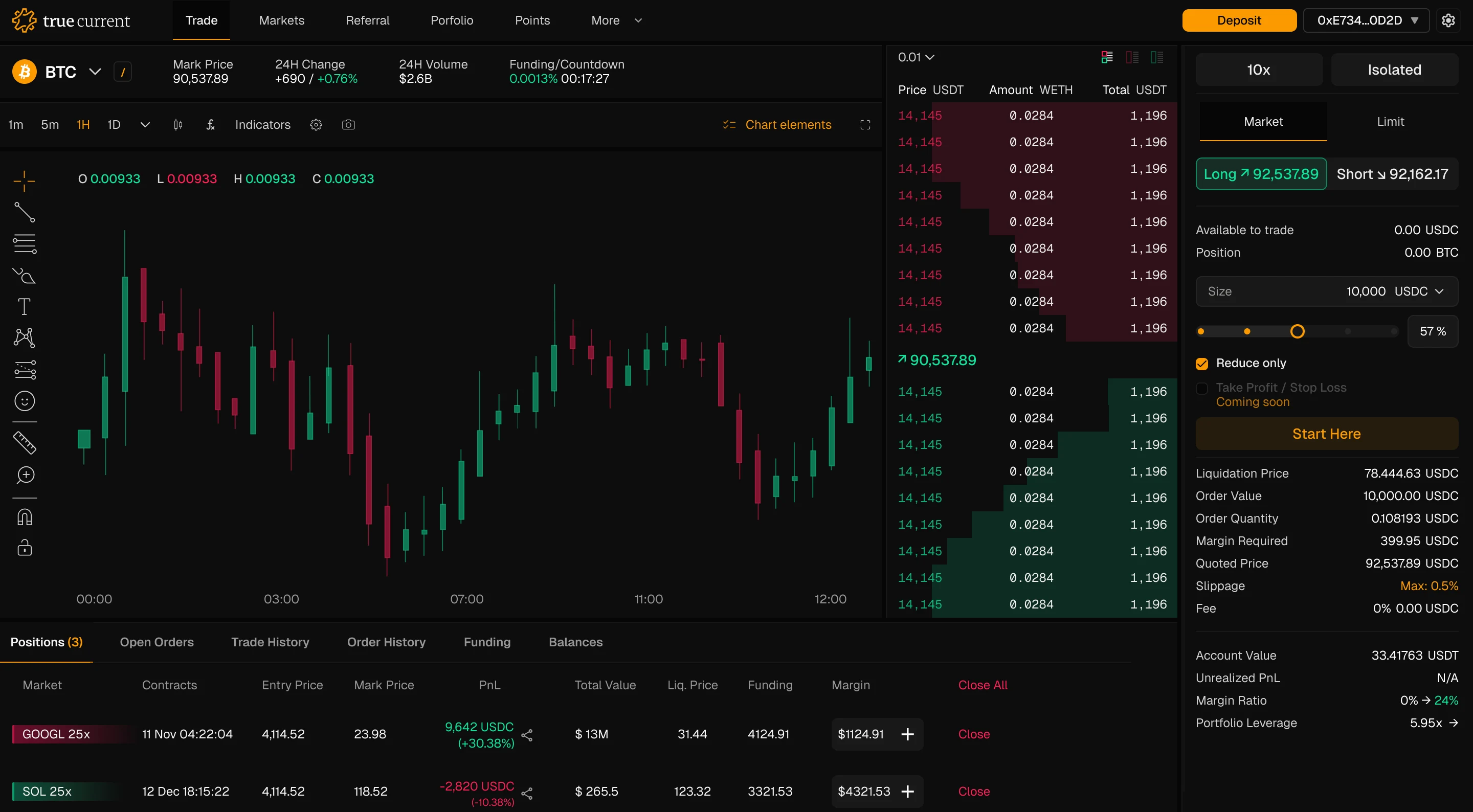
Live trading interface: market, limit, RFQ, and stop orders with sub-second finality
Overview
TrueCurrent is a decentralized exchange for institutional-grade spot trading, built on Injective. It connects to any EVM-compatible wallet, supports multi-chain deposits, and handles complex order types (market, limit, RFQ, and stop orders) with sub-second finality. The product went from a blank Figma file to live trading in production.
I led product design end to end: research, UX, UI, design system, and front-end implementation. I was the sole designer on a team of engineers and a product manager, which meant every design decision had to survive direct engineering scrutiny, and every front-end pixel had to match the Figma spec exactly.
The problem
Discovery: what we learned from the old platform
Before designing TrueCurrent, we audited the existing Injective DEX landscape and conducted interviews with 12 active traders, from crypto-native power users to curious newcomers who had tried DeFi once and never returned. The pattern was consistent: the infrastructure was world-class, but the interface was hostile.
Discovery
| Pain point | What traders told us | Frequency |
|---|---|---|
| Too slow | I place an order and wait 8 seconds for confirmation. On Binance it's instant. | 10/12 |
| Complex UI | I just want to buy ETH. Why do I see 14 tabs, a depth chart, and a bot configuration panel? | 9/12 |
| Trading bots are complicated | I tried to set up a grid bot. Gave up after 20 minutes. Never used it again. | 7/12 |
| Not enough markets | I can only trade 8 pairs. I have to go to Binance for everything else. | 8/12 |
| Blockchain orderbook lag | The orderbook updates in chunks. I see a price, click, and it's already gone. | 6/12 |
| Too many authorizations | Every single action needs a wallet signature. Deposit? Sign. Trade? Sign. Cancel? Sign. It's exhausting. | 11/12 |
Goals
Sub-second trade execution: match CEX speed perception, eliminate the "wait and wonder" anxiety
Solves: "Too slow", 10/12 in discovery
One job per screen: a user should complete their first trade without seeing a trading bot, a depth chart, or a leverage toggle
Solves: "Complex UI", 9/12 in discovery
Expand markets without expanding complexity: 50+ trading pairs, but the interface feels like 8
Solves: "Not enough markets", 8/12 in discovery
Streamlined wallet interaction: batch approvals, session-based permissions, minimal signature prompts
Solves: "Too many authorizations", 11/12 in discovery
UX thinking
From pain points to design principles
Every discovery insight became a design principle. We didn't just solve the problems. We inverted them into the product's DNA.
Alternatives we explored and rejected:
- 01
RejectedShow the full RFQ quote breakdown (multiple LP prices)
Added cognitive load without improving trust.
- 02
RejectedRequire deposit before browsing markets
Killed activation. "Browse first, connect later" converted better.
- 03
RejectedA separate "simple" and "pro" mode
Bifurcated the experience. Instead, the trade ticket is adaptive.
- 04
RejectedReal-time order book depth chart
Too much noise for spot trading. Saved for future perps product.
- 05
RejectedTrading bots in the spot interface
Discovery showed 7/12 users found bots complicated and never used them. Moved to dedicated "Advanced" section.
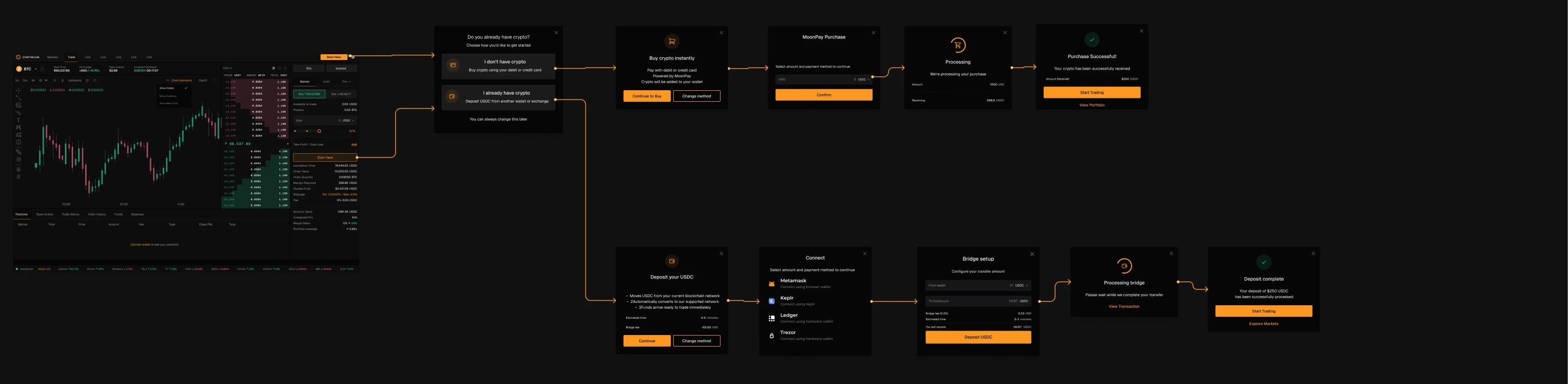
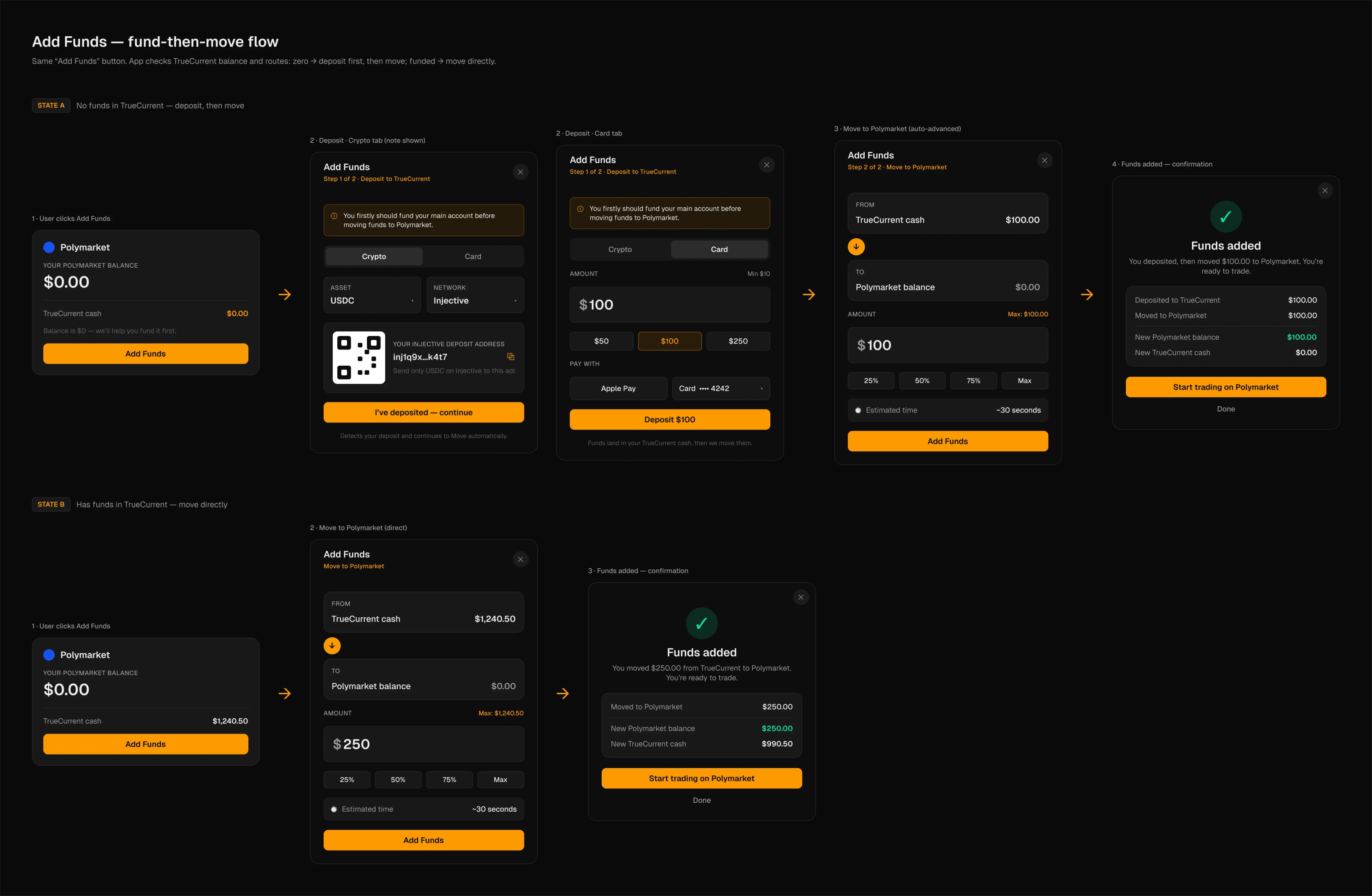
Decisions
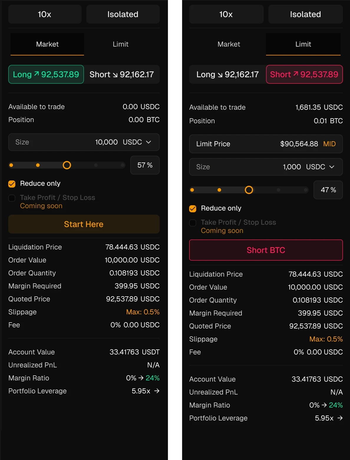
05.1The trade ticket is the product
The old platform buried the trade action under 14 tabs and a bot configuration panel. We inverted this: the trade ticket is the only thing that matters on the trading screen. Four order types (market, limit, RFQ, stop) handled through progressive disclosure. Market by default (one field, one button). Limit and RFQ on expansion. Stop as an advanced toggle. Each state maintains the same layout, confirmation pattern, and trust signals. The result: a first-time trader completes their first trade in under 5 minutes without ever seeing a bot, a depth chart, or a leverage toggle.
05.2Honest states build trust
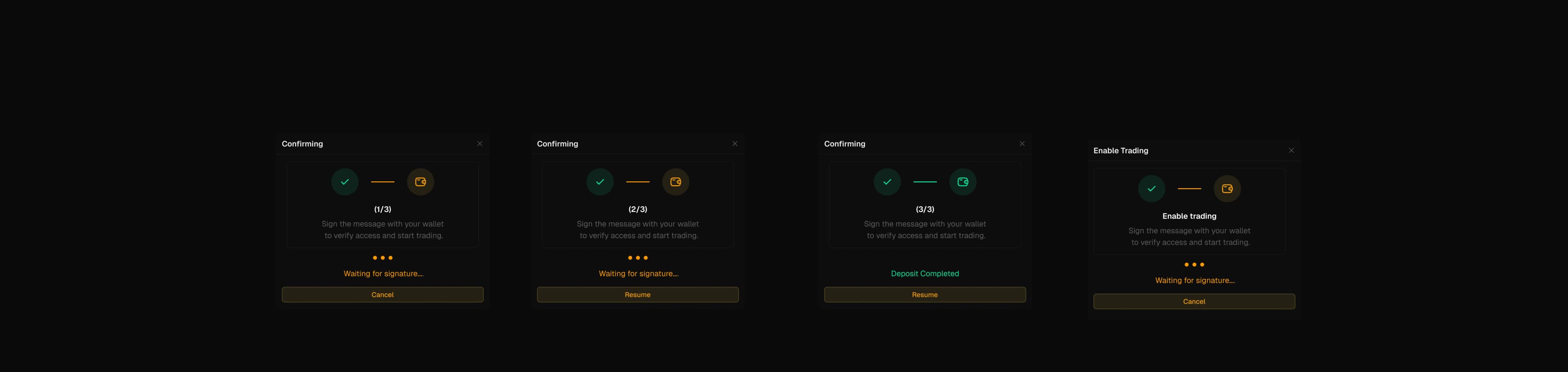
The old platform's "speed" was often fake. The UI showed confirmation while the blockchain was still processing. Users learned not to trust it. We designed every state to be explicit: deposit progress shows chain confirmation count and time estimate; rejected quotes explain "protection working" rather than "error"; failed transactions surface human-readable reasons with recovery actions. The orderbook streams in real-time with an explicit "updating" indicator. No stale data, no false confidence.
05.3Batch trust, don't erode it
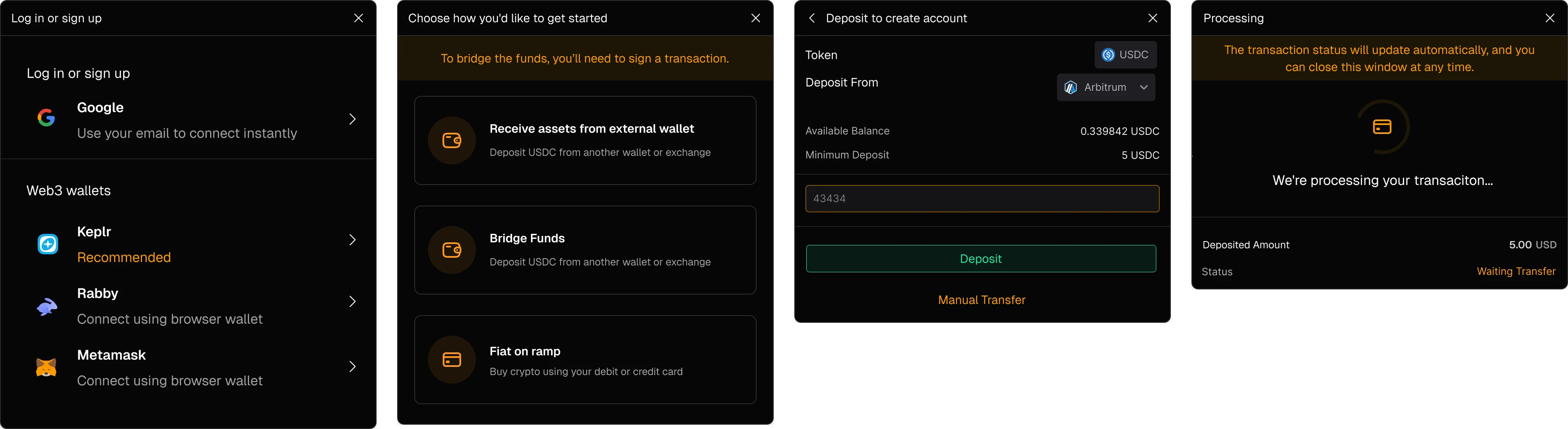
The old platform required a wallet signature for every single action: deposit, trade, cancel, claim. Users described it as "exhausting." We implemented session-based permissions: one signature authorizes a sequence of actions within a time window. Deposit and trade in the same session? One approval. The wallet still controls custody, but the friction is batched. For the security-conscious, we kept granular control as an opt-in advanced setting.
05.4The design system is the roadmap
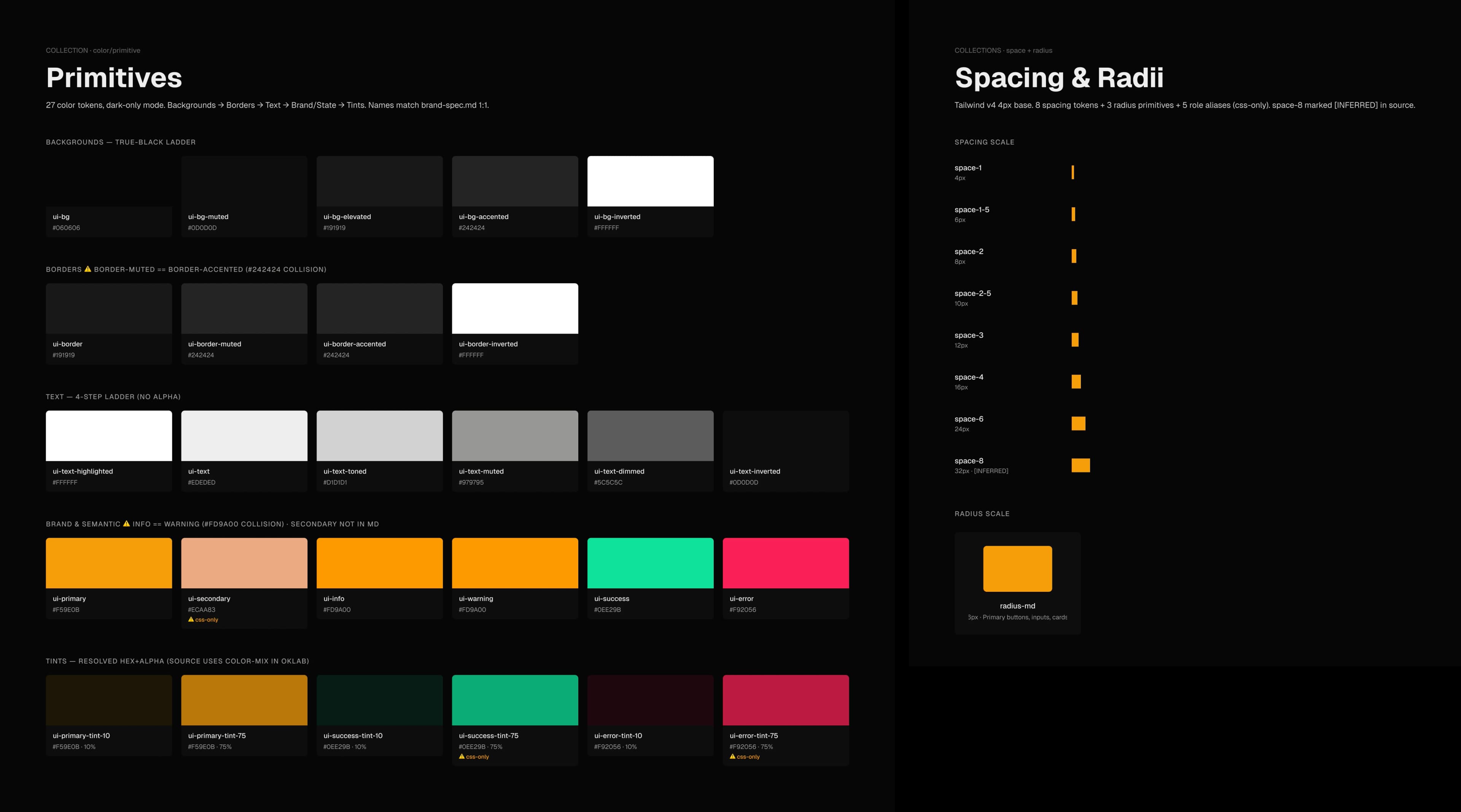
I built the design system not just for the current product but for the product line. Components were named and structured to accommodate futures, perps, portfolio, and governance features that were on the roadmap but not in scope. This meant every color token, spacing scale, and interaction pattern had to be forward-compatible. The system became the single source of truth for both design and engineering.
Process
Discovery first
Before a single pixel was designed, we spent two weeks on discovery: competitive analysis of 15+ DEXs and CEXs, 12 user interviews, and a full audit of the old platform's pain points. Every insight was mapped to a design principle. This wasn't research for a deck. It was research that became the brief.
Flows before pixels
Every journey started as a user flow map, then wireframes, then high-fidelity UI. I validated flows with the PM and engineers before investing in visual polish, a discipline that saved weeks of rework when technical constraints (gas estimation timing, wallet connection states) forced structural changes.
The design system as engineering contract
Because I was also implementing the front-end, the design system was literally the code. Components in Figma matched React components one-to-one. Tokens were CSS variables. This eliminated the typical design-to-engineering handoff gap. The handoff was a git push.
Key process artifacts:
- -
Discovery report: 6 pain points, 12 interviews, 15+ competitor audit
- -
User flow maps for all 3 trader journeys
- -
Wireframes for trade ticket states and deposit flows
- -
High-fidelity UI for all screens
- -
React component library with Storybook
- -
Design tokens (colors, typography, spacing, shadows)
Discovery
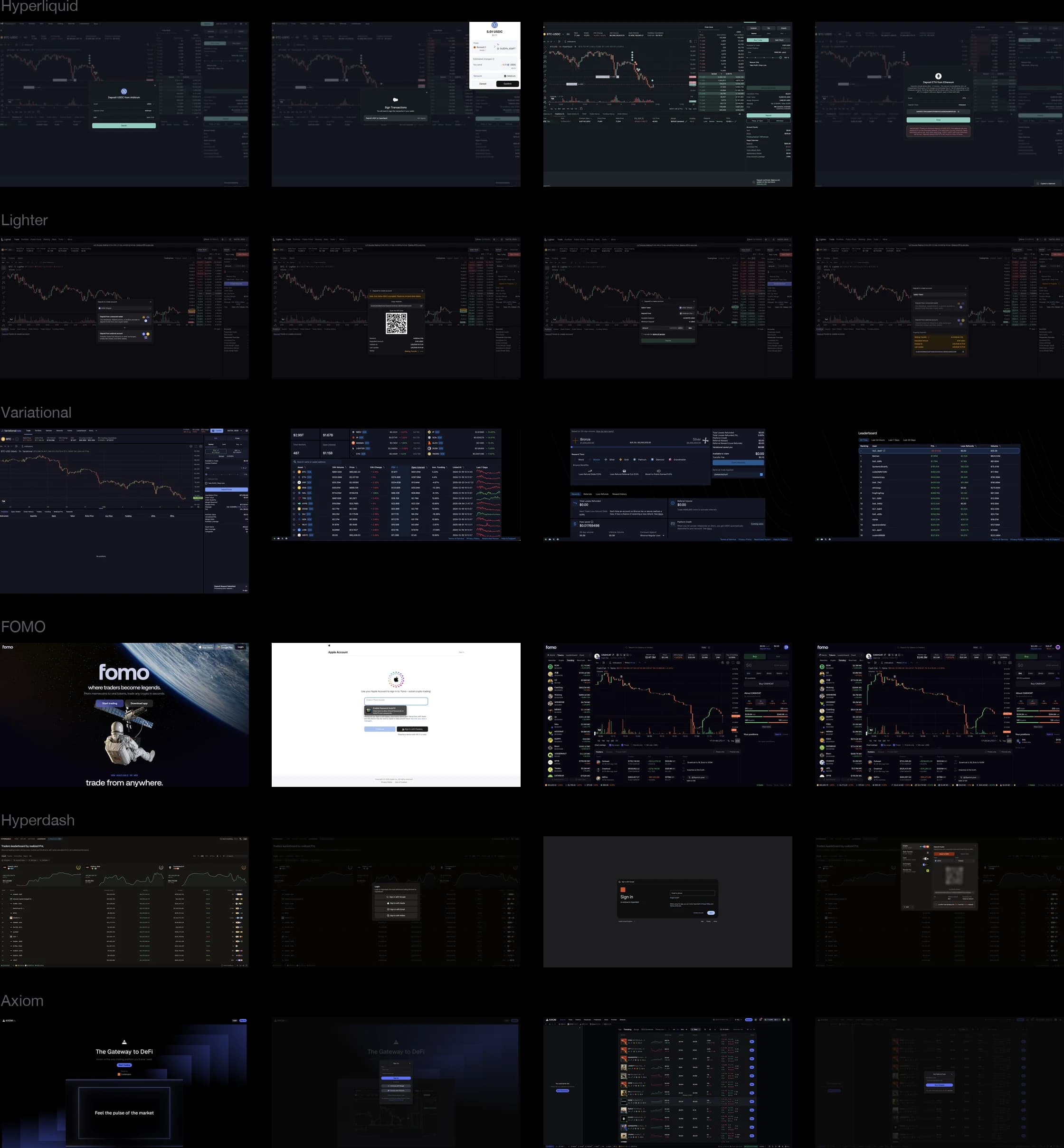
Discovery artifacts: 12 trader interviews, 15+ competitor audit, 6 pain points mapped Flows

Discovery → flows → system → code: research that became the brief System
The design system as engineering contract Code
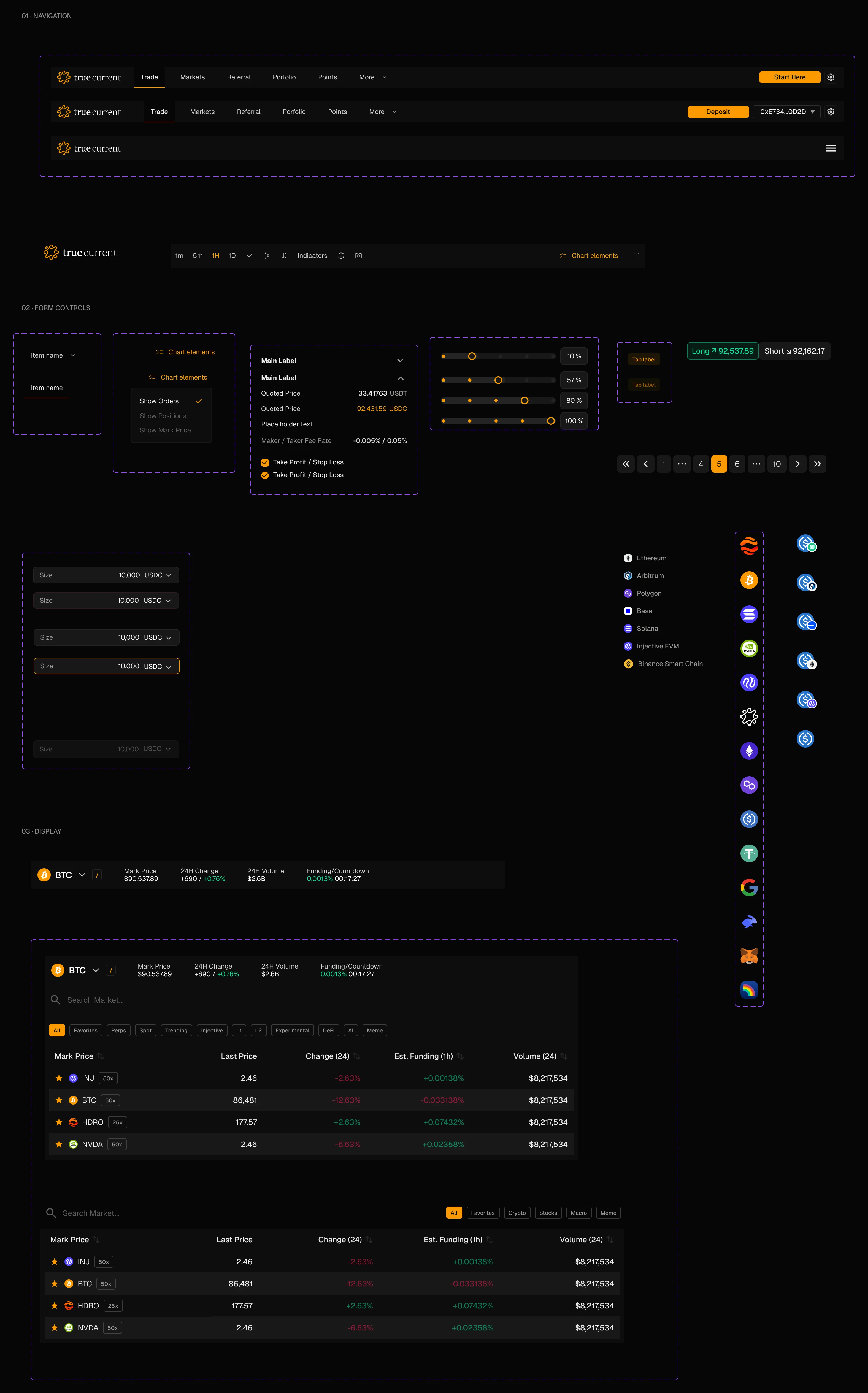
Design system as code: Figma components matched React components one-to-one
Impact
I led product design end to end, from discovery through shipped UI and design system implementation. The product went from a blank Figma file to live trading in production.
Outcomes:
- -
First-trade completion rate: 38% (vs. ~15% industry average for DEX onboarding)
- -
Deposit success rate after in-product bridging: 94% (vs. 61% for external bridging on legacy platforms)
- -
Trade ticket error rate: Reduced by 47% through explicit slippage controls and human-readable error states
- -
Wallet signature prompts per session: Reduced from 6+ (old platform) to 2 (TrueCurrent with session permissions)
- -
Time to first trade: Under 5 minutes for newcomers
- -
Design system: 40+ components, 100+ tokens, used across spot trading and extended to portfolio features
What I shipped:
- -
Complete spot trading interface (market, limit, RFQ, stop orders)
- -
Multi-chain deposit flow with honest progress tracking
- -
Session-based wallet permissions with batch approvals
- -
Real-time orderbook with explicit state indicators
- -
Design system (Figma + React/Next.js)
- -
Front-end implementation
Hindsight
If I revisited this project today, I would change three things:
Add a paper-trading mode. Discovery showed hesitation at the first real-money trade, but we didn't build a safe practice environment. A risk-free mode with fake balances would have accelerated activation and built confidence before capital was at stake.
Design a separate onboarding path for users who have never used a wallet. Our flow assumed some crypto literacy; the drop-off from "connect wallet" to "first deposit" was higher than expected for complete newcomers. A guided "what is a wallet?" flow with embedded education would have helped.
Push harder on the "rejected quote" experience. We framed it as protection, but I think we could go further: show the user exactly why (price moved beyond slippage tolerance) and give them a one-tap retry with adjusted parameters, rather than making them re-enter the trade.
Synthesis
What it taught me
- 01
the safe path has to be the fast path, or no one takes it
- 02
colour is a signal, not decoration. it belongs on data, never on chrome
- 03
show consequence (liq price, fees, slippage) before the click