02 - Xapo Bank - 2023
Xapo Bank: Wealth Management App
Investing inside a bank built on trust
Led end-to-end design of Xapo Bank's wealth product, from POC to closed beta to launch, giving emerging-market users access to US-dollar savings and 600+ investment assets.
- 930closed-beta users
- 93%task-success rate
- $450avg. invested per user
- 600+assets at launch
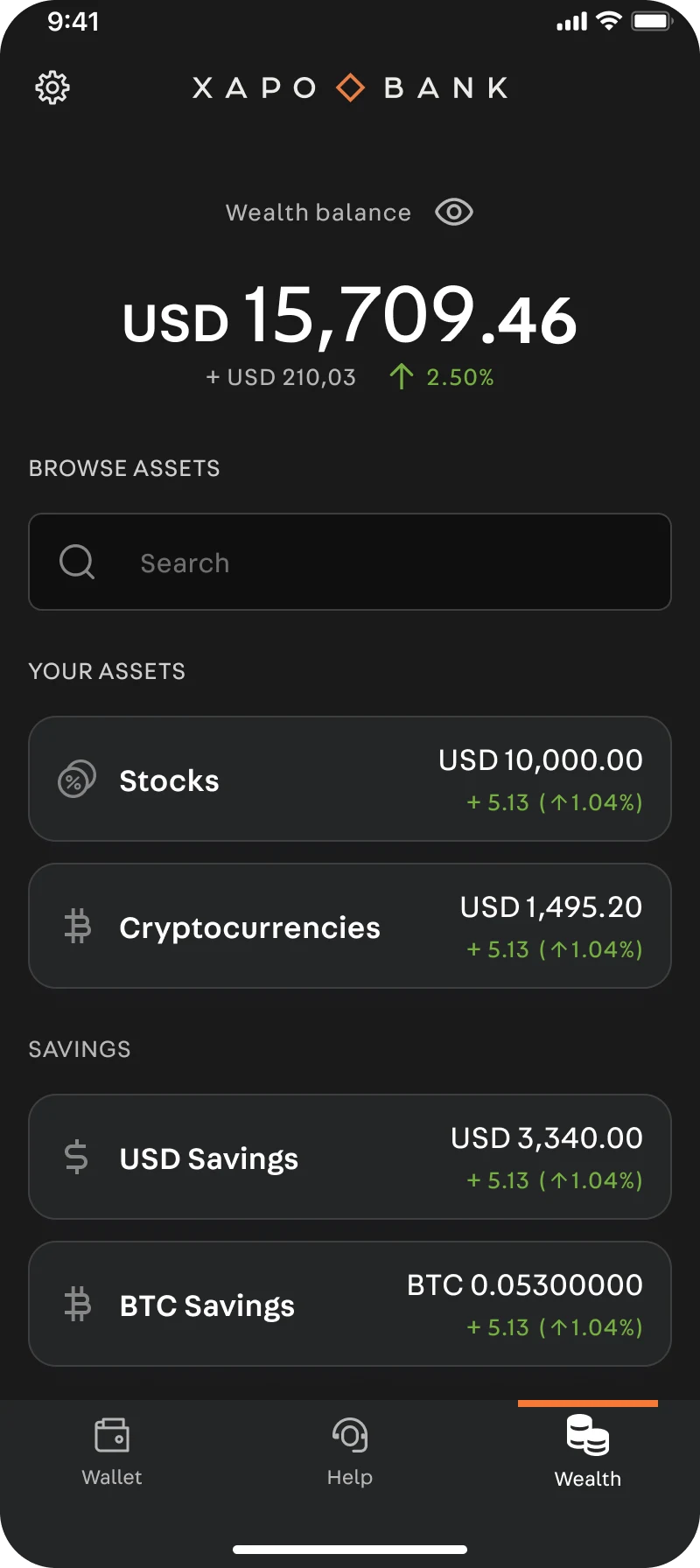
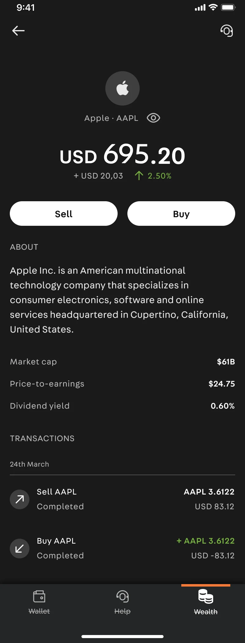
Wealth home: calm, conservative, familiar
Overview
Xapo Bank built its reputation on one promise: don't lose my Bitcoin. It became a fully licensed bank serving members in emerging markets, primarily Latin America and Africa, who chose it because it is calm, conservative, and safe. Wealth was the next chapter: giving those members access to 600 assets (whole and fractional shares across stocks, ETFs, and a curated set of cryptocurrencies) inside the bank they already trust.
I shaped the design direction and strategy for Wealth and designed its core flows end to end. I worked with designers, developers, stakeholders, legal, and marketing. In a regulated bank, every word on every screen is a compliance conversation.
The problem
Investing products usually optimize for engagement: green flashes, streaks, day-trading energy. Xapo members are the opposite audience. Our research showed the core user: 50+ years old, $200K+ in savings, living in emerging markets, looking for dollar-denominated stability. They are long-term, safety-first, and allergic to casino patterns.
And we shipped into the hardest possible moment: the 2022-23 downturn, when a series of high-profile platform failures had just taught the world that crypto platforms lose people's money. Trust in the industry had collapsed.
The brief was this: extend the trust of "don't lose my Bitcoin" into "grow my wealth." Build access to markets that feels like the bank, not a gambling app. Reassurance wasn't a nice-to-have; it was the job.
Goals
- 01
A cautious member should travel from curiosity to a funded first investment feeling like they're banking, not gambling
- 02
Six hundred assets should feel navigable, not overwhelming
- 03
Ship a real MVP in one quarter without a single corner cut on clarity or compliance
- 04
Design for a user base that is older, wealthier, and more risk-averse than typical fintech adopters
UX thinking
The research phase was fueled by the stakeholders' vision: enable people in emerging markets to access US dollars and invest in stocks, crypto, and other financial instruments. We validated this through a questionnaire to existing Xapo users. The findings confirmed the hypothesis: users with significant savings wanted investment advisors and wealth expansion tools. Xapo wasn't chasing user volume. It was chasing user quality.
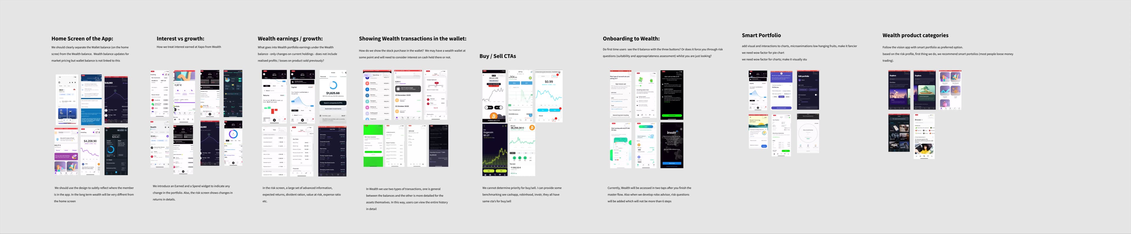
I benchmarked 20+ competitor apps (via 11:FS) to understand what functions were table stakes and what could be added value. The gap was clear: most investing apps were built for young, engaged traders. None were built for cautious, older savers who wanted to park wealth, not play with it.
The journeys we mapped:
- 01
First-time investor: Eligibility check → KYC → fund Wealth → browse → first investment
- 02
Existing member adding Wealth: Discover Wealth tab → understand what it is → fund → invest
- 03
Repeat investor: Browse portfolio → add to position → review → confirm
Edge cases that shaped the design:
- -
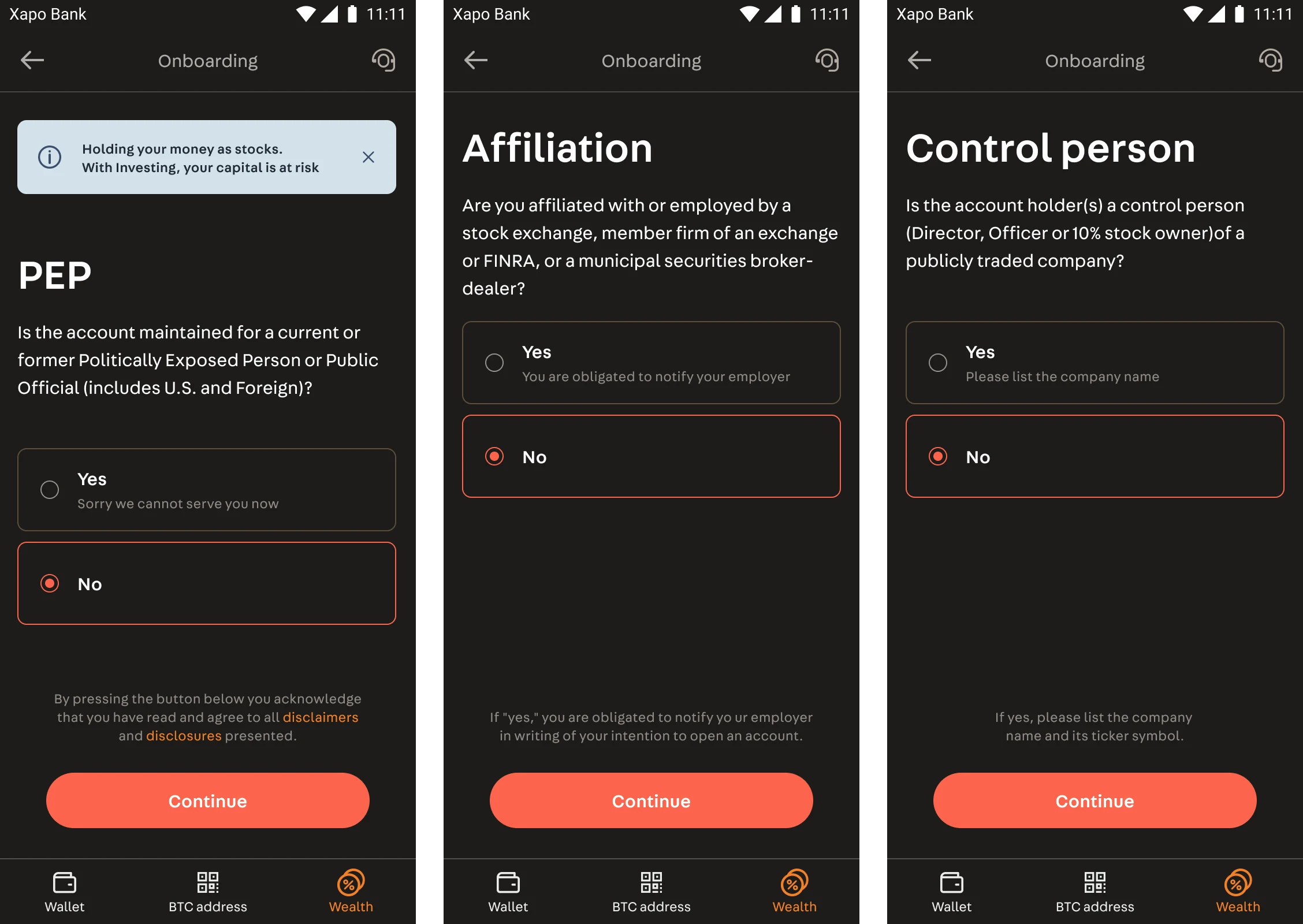
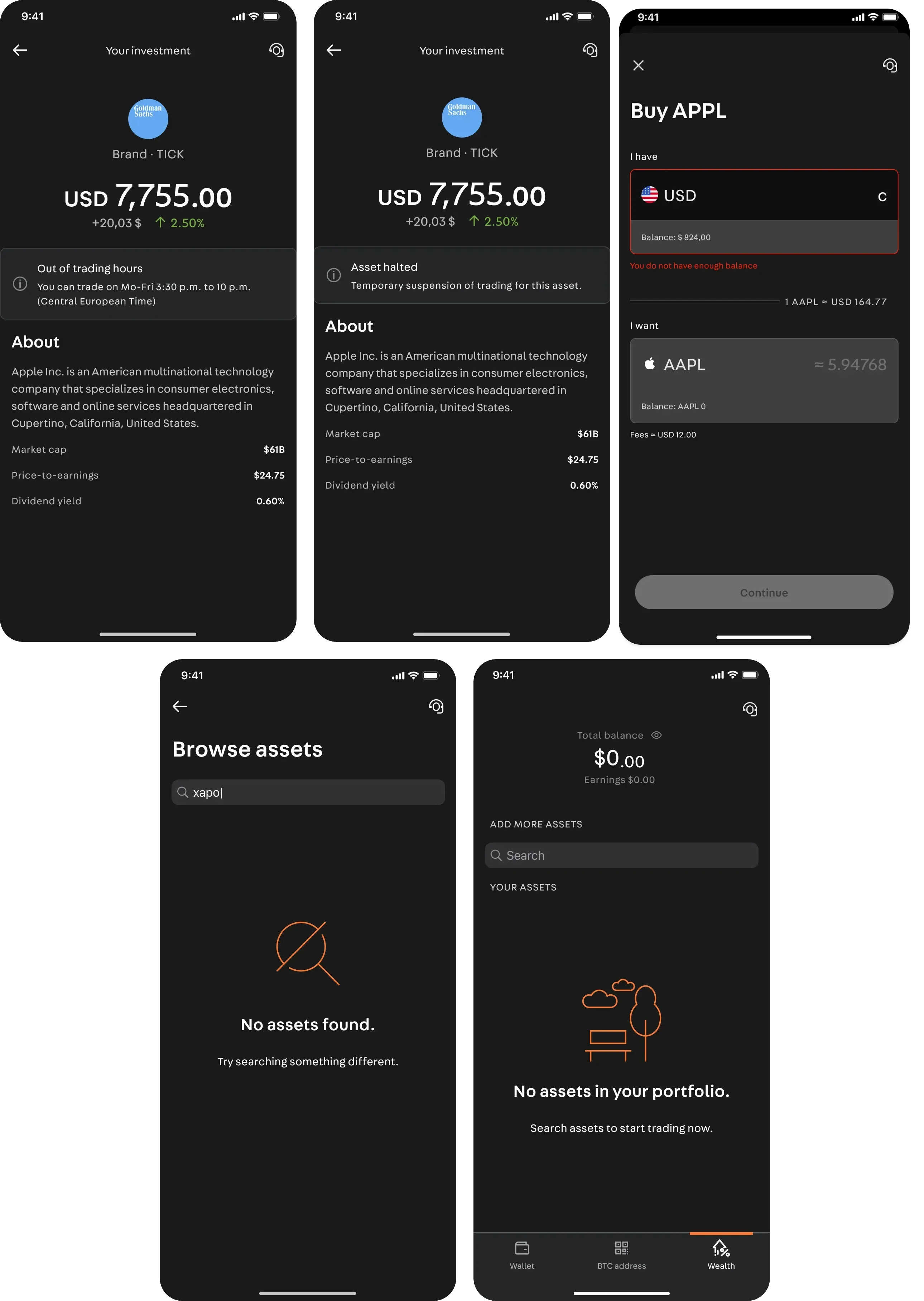
Eligibility rejection: Not all members qualified. Clear explanations and alternative paths, not dead ends.
- -
Out of trading hours: Show status transparently instead of a disabled button with no context.
- -
Trading halt: Explain why, not just block the action.
- -
Insufficient balance: Offer transfer from main savings, don't just say "no."
- -
Order error: Clear recovery path with specific next steps, not generic "try again."
Alternatives we explored and rejected:
- 01
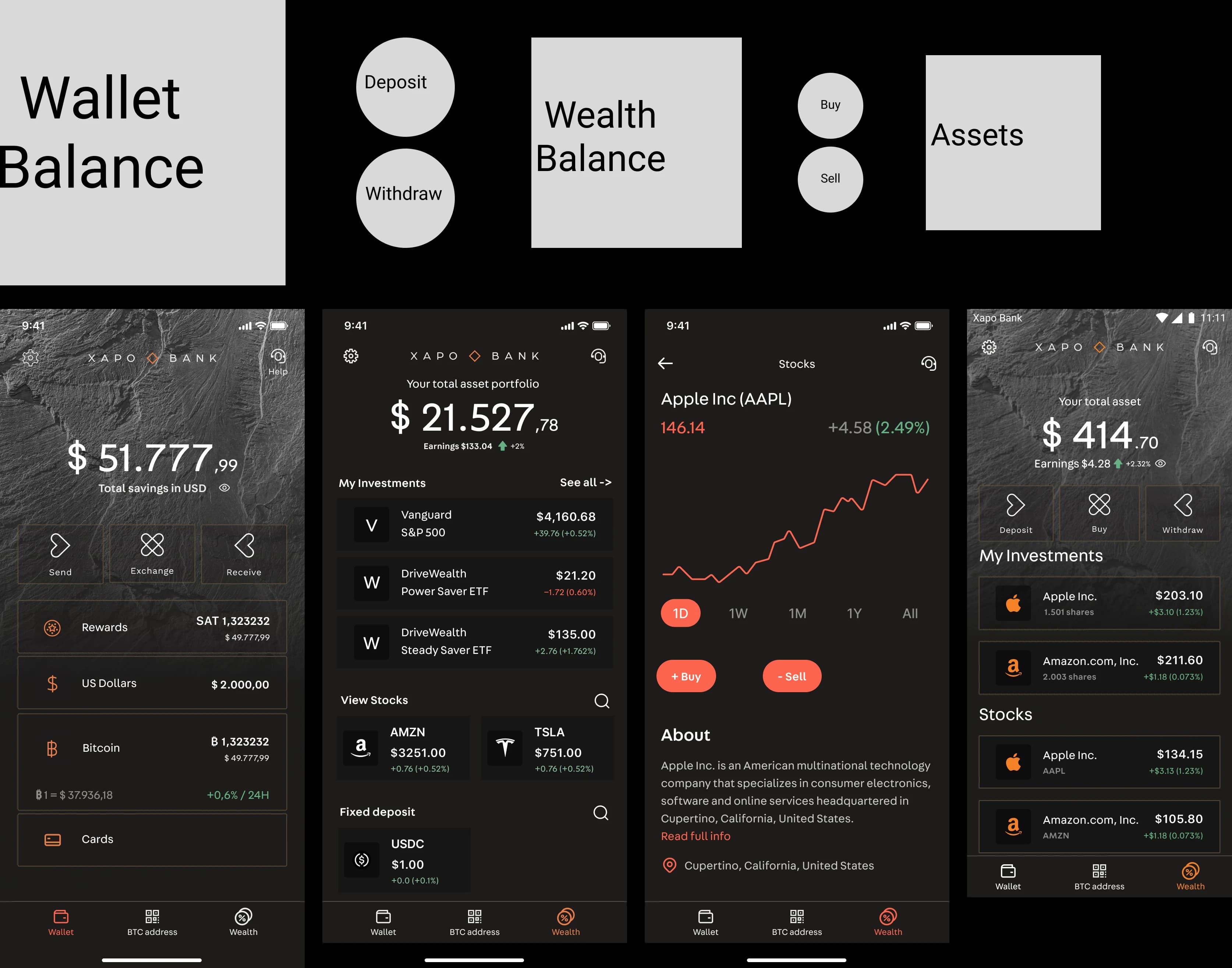
A separate "Invest" tab in main navigation → Rejected: felt like a different product. Wealth lives inside the existing wallet structure.
- 02
Real-time stock tickers and price alerts → Rejected: too trading-app, contradicts calm positioning.
- 03
Social features (see what friends buy) → Rejected: wrong audience. Privacy-first members; social proof would erode trust.
- 04
Gamification (streaks, badges) → Rejected: explicitly off-brand. "Calm by design" means no dopamine loops.
- 05
A "simple mode" vs. "pro mode" split → Rejected: bifurcated the experience. Instead, flows are adaptive: simple by default, advanced controls available.
Decisions
Decision 1: Curation is a trust feature
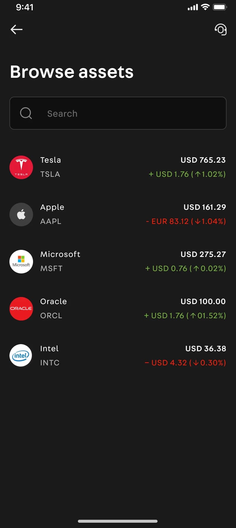
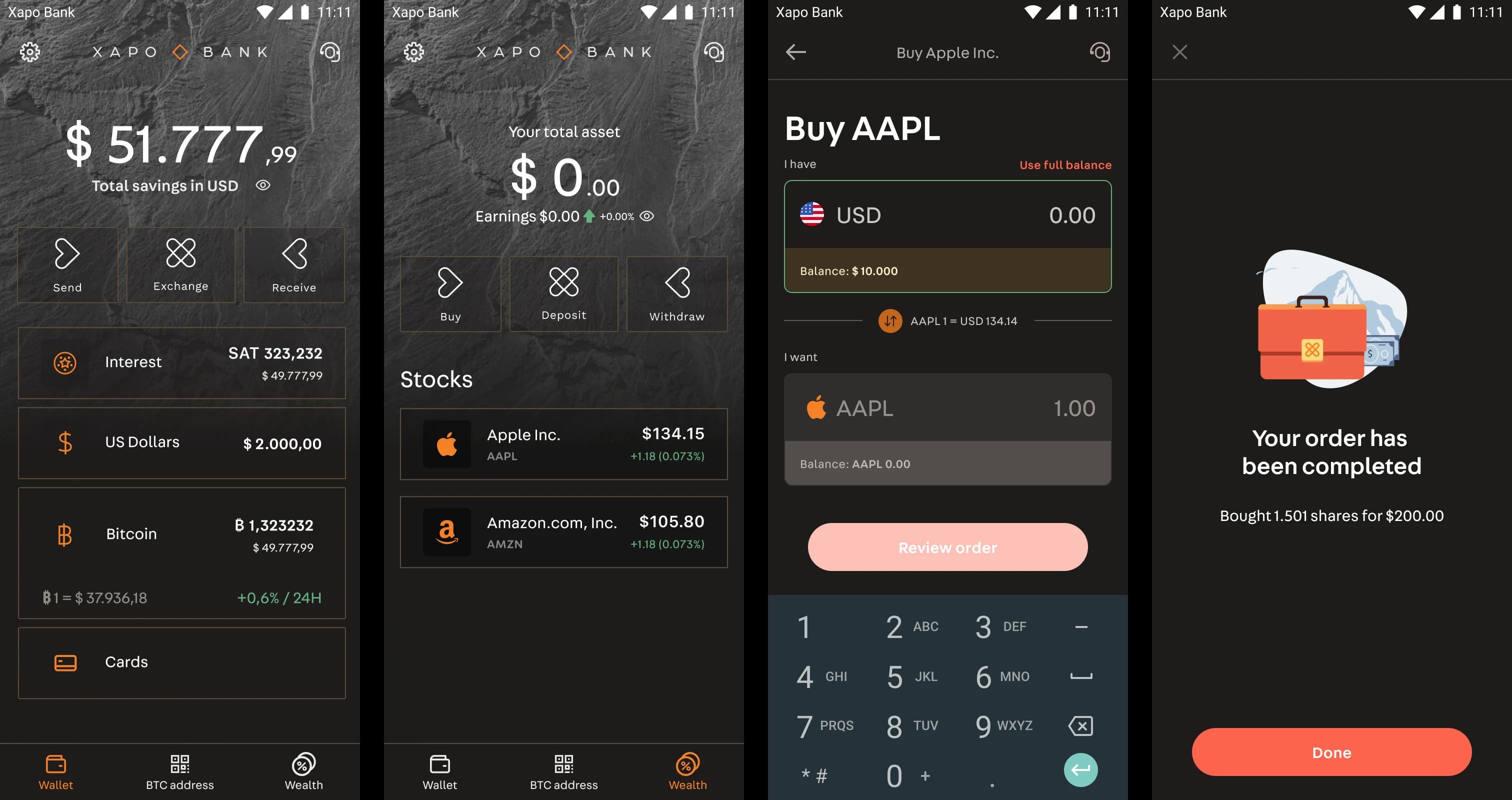
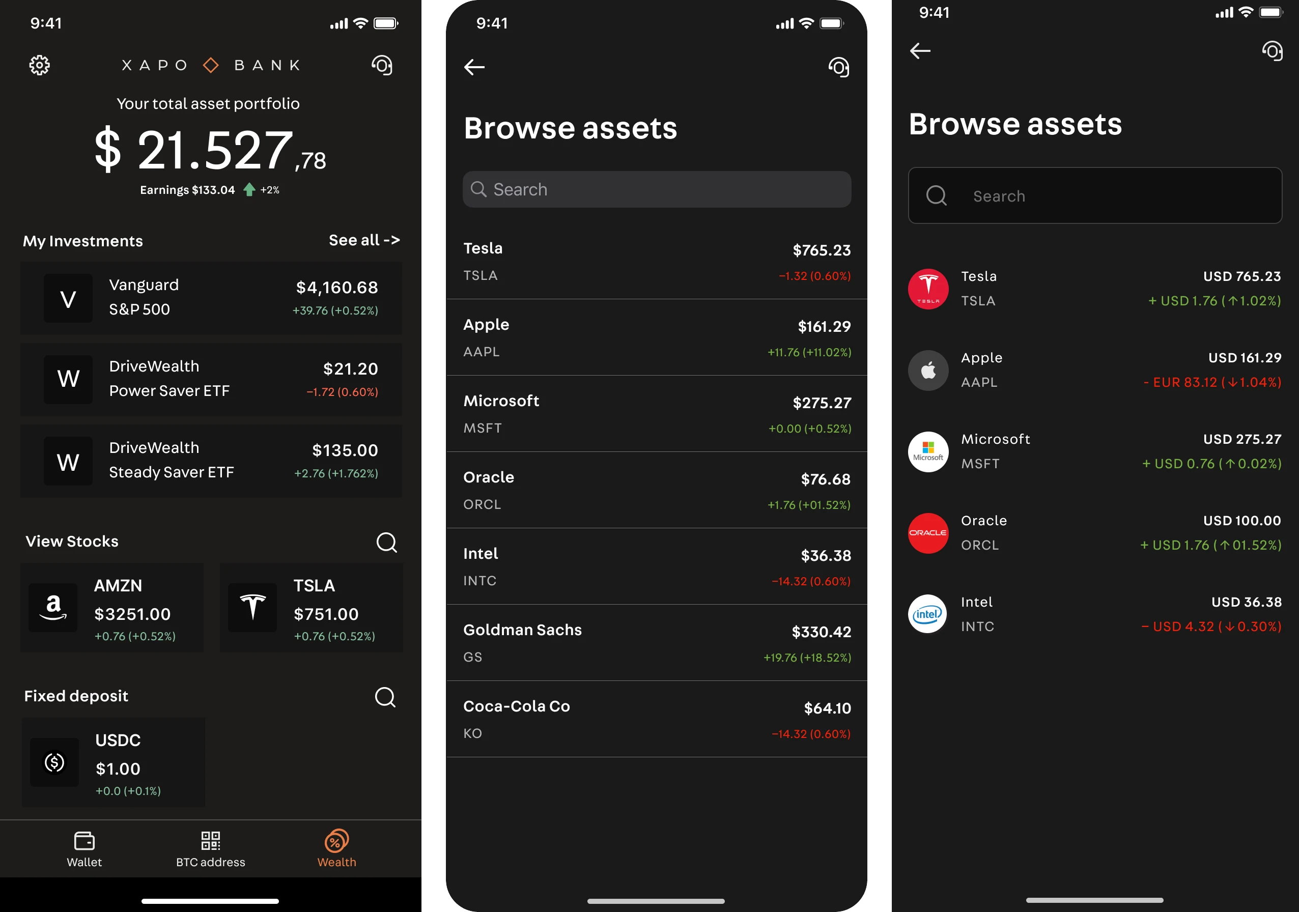
Six hundred assets is a paradox: enough choice to be a real investing product, enough to paralyze a careful person. The catalog was built to be entered gently: search when you know what you want, curated paths when you don't, and a deliberately selective crypto list rather than an everything-listed free-for-all. Fractional shares lowered the stakes of the first step: a first investment can be small, reversible, and calm.
Decision 2: Design the trust moments
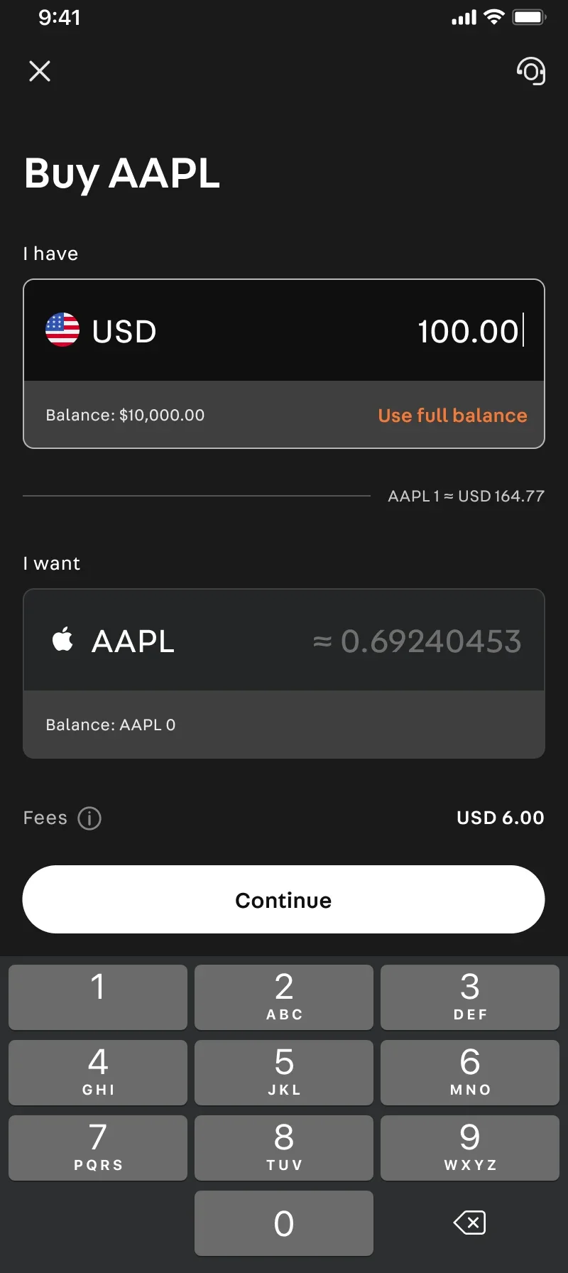
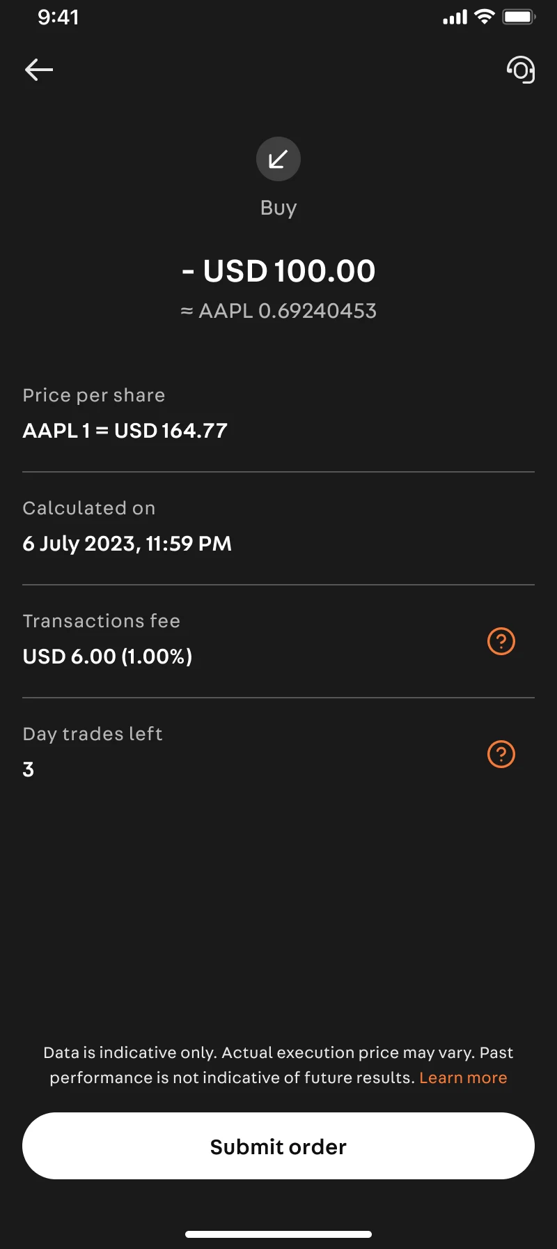
In a trading app, the hero screen is the chart. In a bank, the hero screens are the ones where money moves. We spent disproportionate design time on the moments where a member's anxiety peaks: funding Wealth for the first time, reviewing and confirming an order, and understanding exactly how assets are held. The custody story is told at the point of purchase, not buried in a help center.
Decision 3: Calm by design
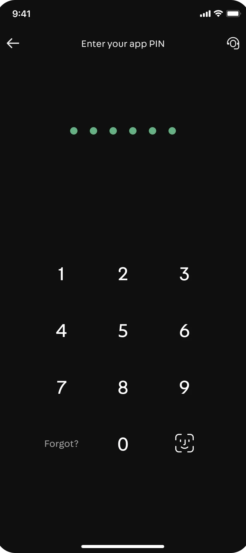
The visual and behavioral language was tuned against the casino: long-term framing over tick-by-tick drama, restrained data presentation, confirmation patterns that slow the member down at exactly the right moments. The measure of success was simple: Wealth had to feel like a room in the same bank, not a door into a different building.
Process
Every journey started as a sketch alongside project managers, then flow maps, then wireframes. Visual design entered only once the structure survived scrutiny from legal and stakeholders. The POC was built with minimal resources: an Android frontend, a backend team, and three KYC screens to prove eligibility and asset access could work.
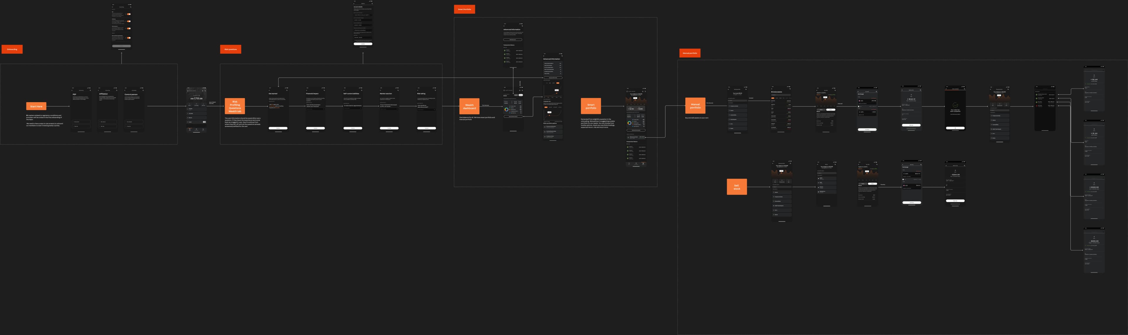
After the POC succeeded, I worried about how the slice-by-slice roadmap would affect the overall in-app experience. I created a large vision map to show stakeholders and product teams what we were aiming for. It helped the campaign, gave dev teams a north star, and let us think through the roadmap better.
For MVP, we improved the eligibility flow, optimized KYC to a minimum, expanded requirements with account details and Wealth statements, and grew the asset list to 150+ stocks. Corner cases were thought through. The design system evolved alongside. New components and requirements appeared constantly, increasing complexity, but the system absorbed it.
Impact
I shaped the design direction and strategy, designed core flows end to end, and partnered with engineering, legal, and marketing through a company transition and shifting product map.
Outcomes:
- -
930 closed beta users before official release, with an average of $450 invested per user in real money
- -
93% task completion rate. Users successfully completed onboarding, search, buy/sell, and transaction detail flows
- -
150 feedback tickets collected, primarily around onboarding eligibility criteria and feature requests, which informed post-MVP iterations
- -
MVP shipped in 3 months from kickoff; extended with new capabilities the following quarter
- -
Amplitude dashboard showed significant increase in engagement and conversion rates
What I also shipped alongside Wealth: Lightning Network, USDC, and USDT rails inside the regulated wallet.
Hindsight
If I revisited this project today, I would change three things:
- 01
Push harder on the "first investment" guided journey. We assumed curiosity would carry users from browsing to buying, but the beta data showed hesitation at the funding step. A clearer "fund → browse → invest" funnel with progress indication would have accelerated activation.
- 02
Add educational content at the asset detail level, not just in help. We put the custody story at purchase; I'd also add a "what is this asset" layer for first-time investors who don't know what an ETF is.
- 03
Design for the "portfolio empty state" more deliberately. The first-time Wealth screen with $0.00 felt like a dead end. I'd add a clearer "start with $5" CTA and a sample portfolio preview to reduce the psychological barrier of the first investment.
Synthesis
What it taught me
- 01
trust is built in the boring moments: states, confirmations, clarity
- 02
expose blockchain reality only where it protects the user
- 03
wealth wants calm, not gamification